SECTION 16 REPORTING
COMPANY
Workiva
MY ROLE
UX Designer
SUMMARY
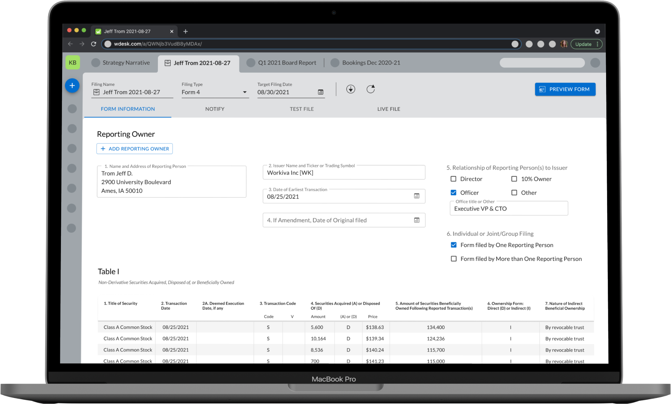
I designed the next generation of Section 16 Reporting within the Workiva platform. Section 16 is a key part of Workiva's holistic filing solution for SEC customers with 40% of our base utilizing the current experience.
ABOUT THE COMPANY
Workiva's goal is simplify complex work and be the leader in regulated reporting and financial transparency. They are recognized as a leader in SEC reporting and compliance. Section 16 is included in the SEC solution and enables user to report transactions involving company equity securities by officers, directors and 10% shareholders. In other words, any time a CEO of a public company conducts a trade of the its stock, it must be reported to the SEC.
PROBLEM STATEMENT
Current Workiva Section 16 users love the current form interaction and appreciate all information is visible as they add transactions for officers and directors within the company.
However, users expressed concern with the entire filing process from form creation to submission. They identified the footnotes, test file and live file experiences were a bit 'clunky'.
How might we port the key experiences of Classic Section 16 to NextGen in such a way we can preserve user expectations while simplifying the experience?
SOLUTION
Design an experience that provides a streamlined filing workflow leveraging Workiva's current filing wizard experience. Success is defined as every customer can file successfully without CSM intervention.
KEY IMPROVEMENTS
- Leverage existing filing wizard tech to streamline workflow
- EDGARize supporting documents (done outside Workiva today)
- Clear Test and Live File delineation
- Create a more fit for purpose footnote experience
- Enable template creation as most footnotes contain similiar text with different dates
RESPONSIBILITIES
- facilitating stakeholder alignment
- conducting user research
- facilitating ideation workshop
- creating competitive analysis
- designing information architecture
- wireframing
- user testing
- prototyping
- coding Dart
- developing key analytics
PROCESS
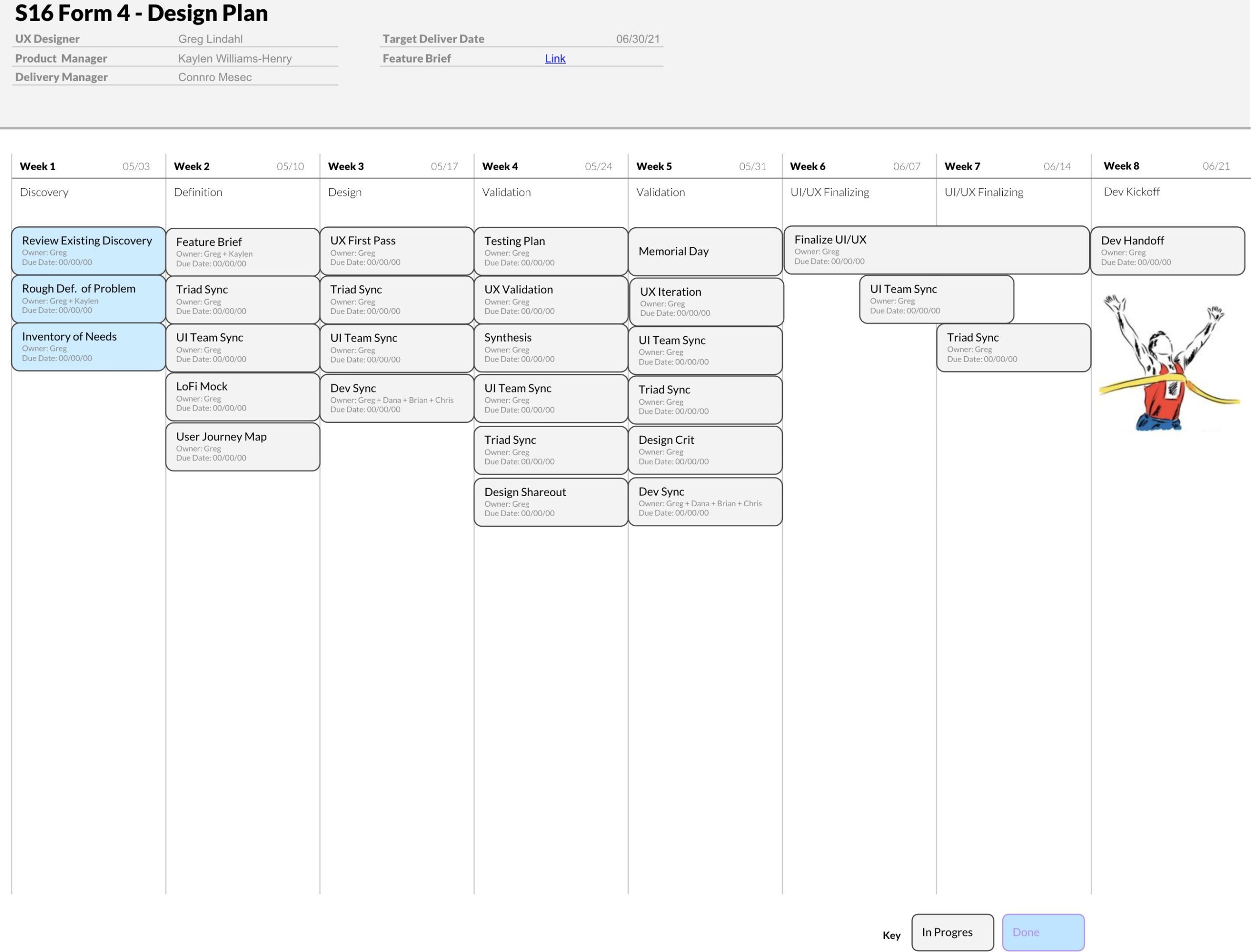
My process began with understanding what Section 16 is and where it fits in our customer's reporting workflow. I started with a project plan outlining my process for the form 4 portion of the experience initially.
I facilitated user interviews to understand how they were using Section 16, what was working and what wasn't about the current experience. By facilitating a discovery synthesis session, we identified key themes we could focus on when designing the next generation of Section 16 reporting.
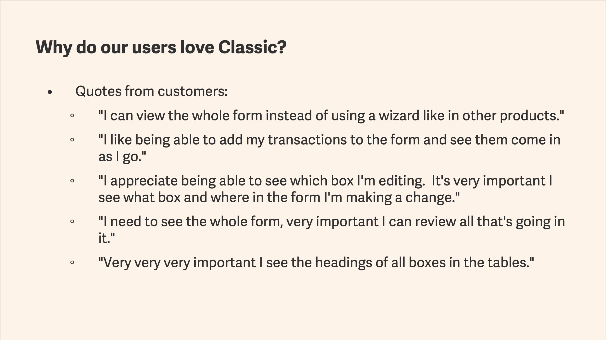
Information built from the data collected during our initial user interviews. Presented as part of a stakeholder alignment session to create a shared understanding on vision.
Also helped drive our success criteria for wanting to keep the features our customers love while trying to simplify the workflow.
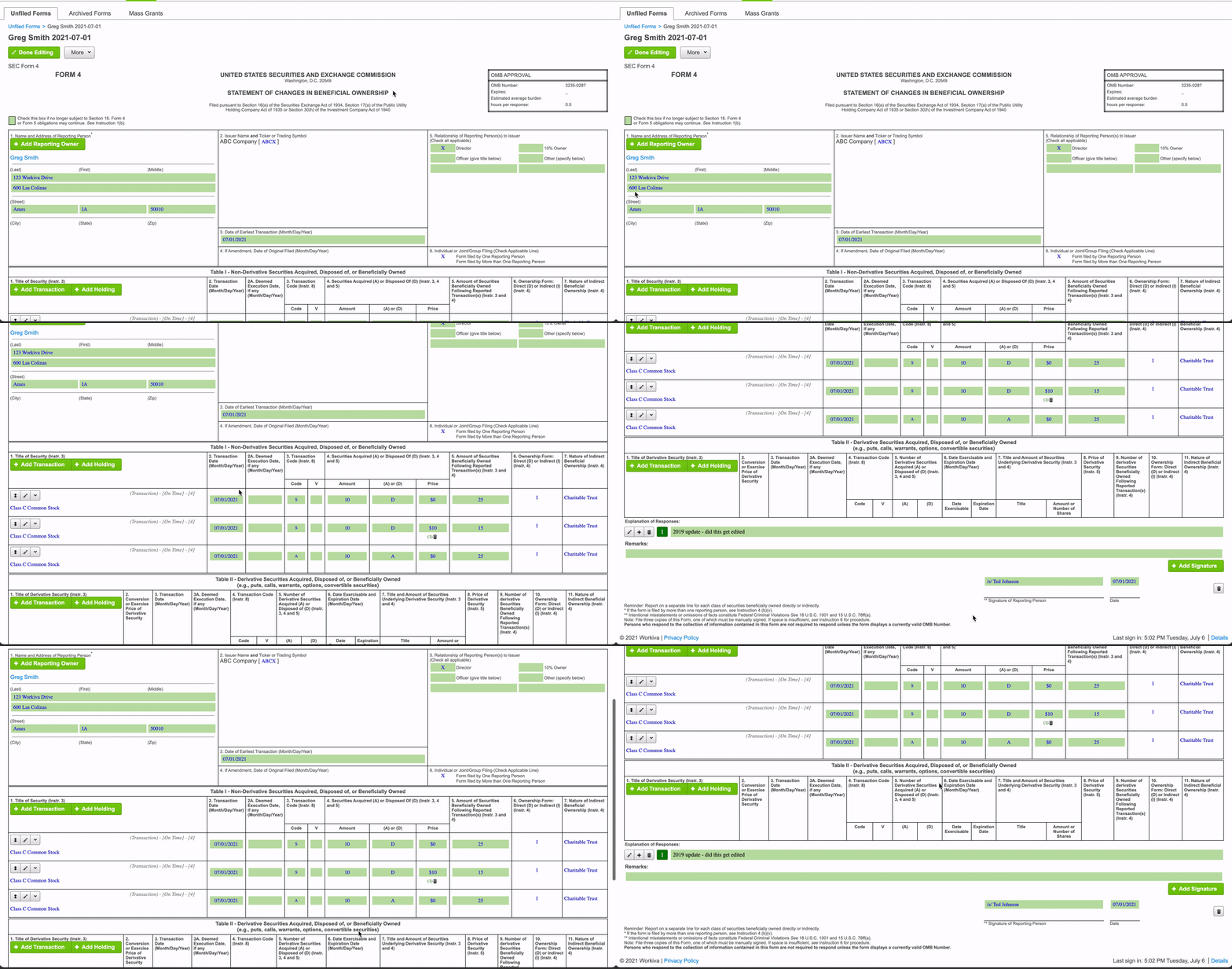
Our Classic experience is loved by our customers because it enables them to:
- View the entire form vs adding transactions via a wizard or modal
- Can view all of the table headers within the form columns
- Can quickly identify which fields are editable with our lovely green background
Seeing the information is important for our users as they are often lawyers and want to see all the words on the page.
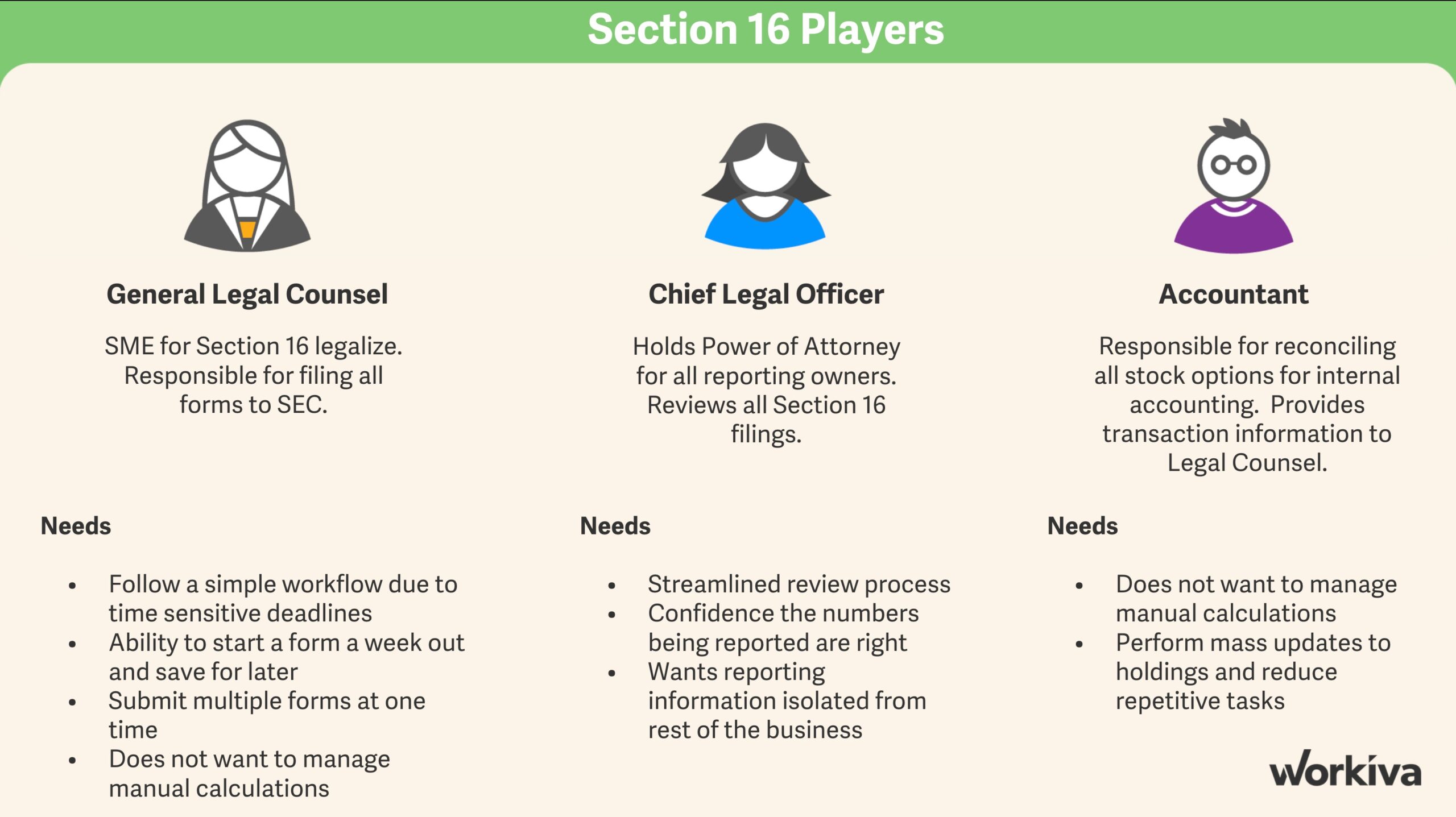
I identified three key players in the Section 16 story and used this information to create a picture of who we would be designing for on the project.
Section 16 reporting is often completed by the legal departments of public companies. This varies from the typical user which is an Accountant or Financial Analyst.
All personas involved stated confidence in the numbers being reported was their top priority.
I dove deeper into a couple of the players to drive alignment around the importance of the workflow being easy and opportunity for automation to decrease manual tasks, e.g. manual calculation adjustments.
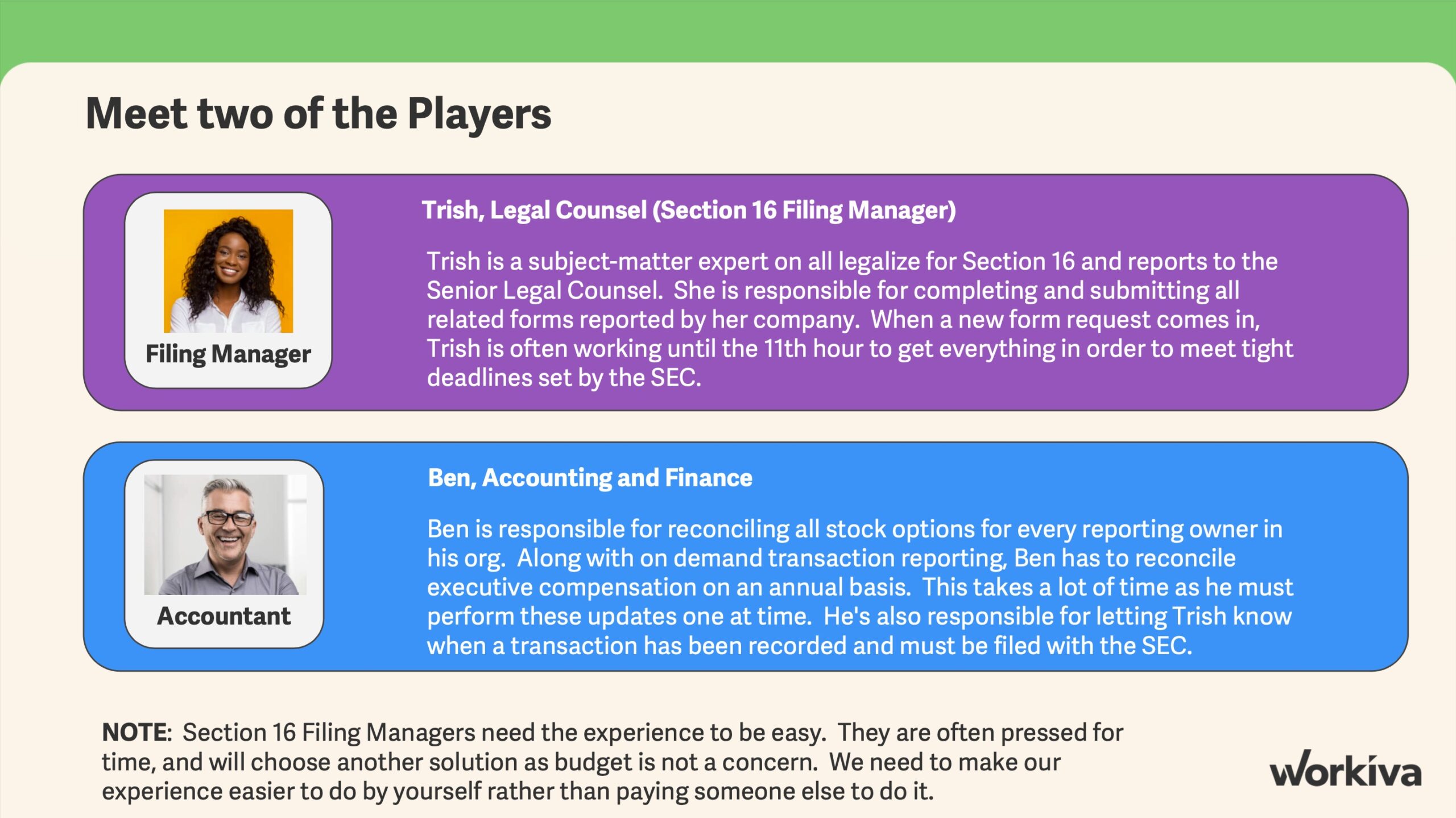
USER STORY
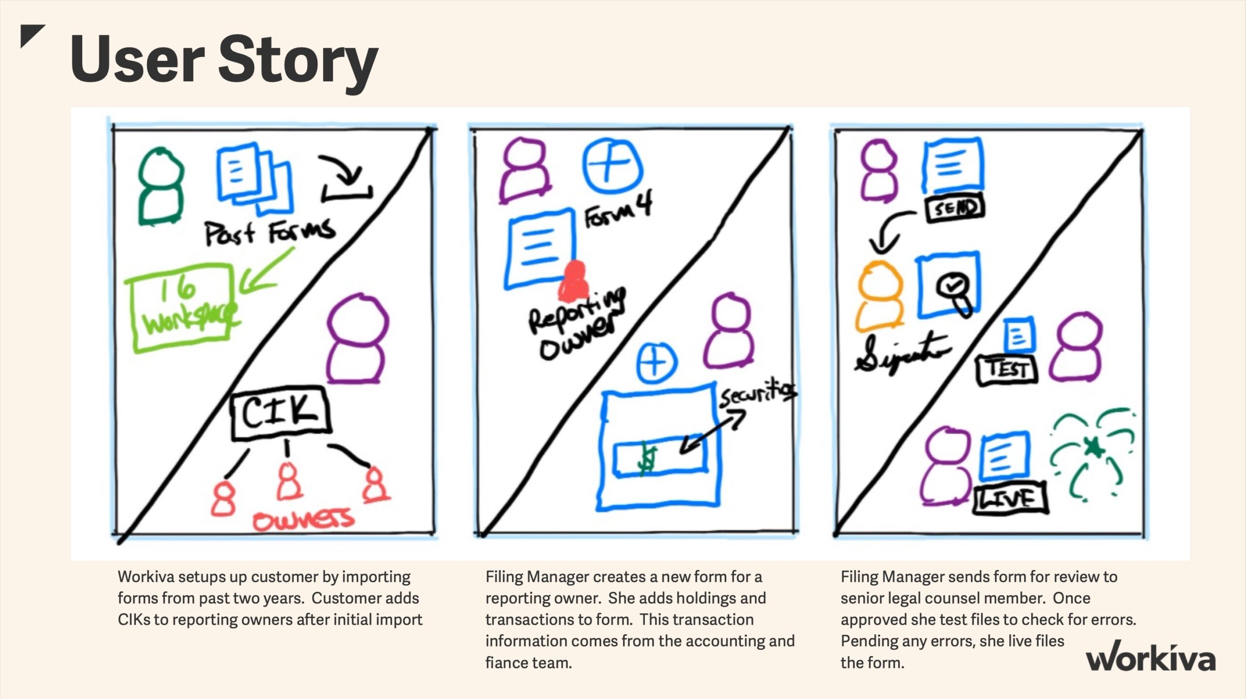
High level sketch of the user story. Based on our current implementation process, I identified opportunities that would help streamline customer's workflow using our existing filing wizard experience.
Specifically enabling users to add supporting documents like a Power of Attorney to the filing within the new experience (currently done outside Workiva in Classic), as well as, separating the test and live file processes reducing errors and allowing for better tracking.
Having identified some key improvements, I diagramed what the new streamline workflow could look like.
I used a Form 4 as an example as this is the most common form filed with our current customer base.
The user spends the majority of the time adding holdings or transactions so extra attention was to be spent on those interactions within the form.
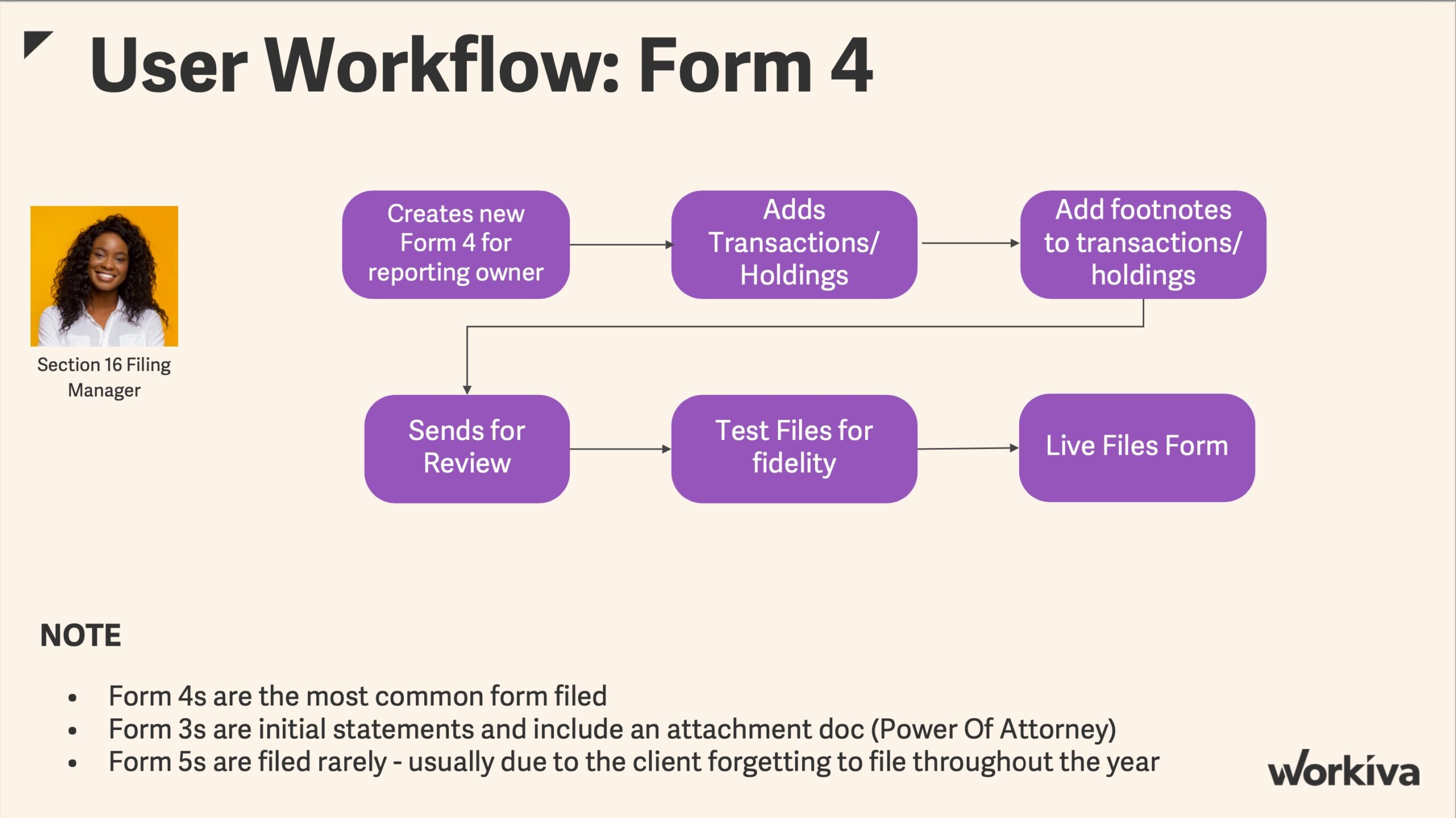
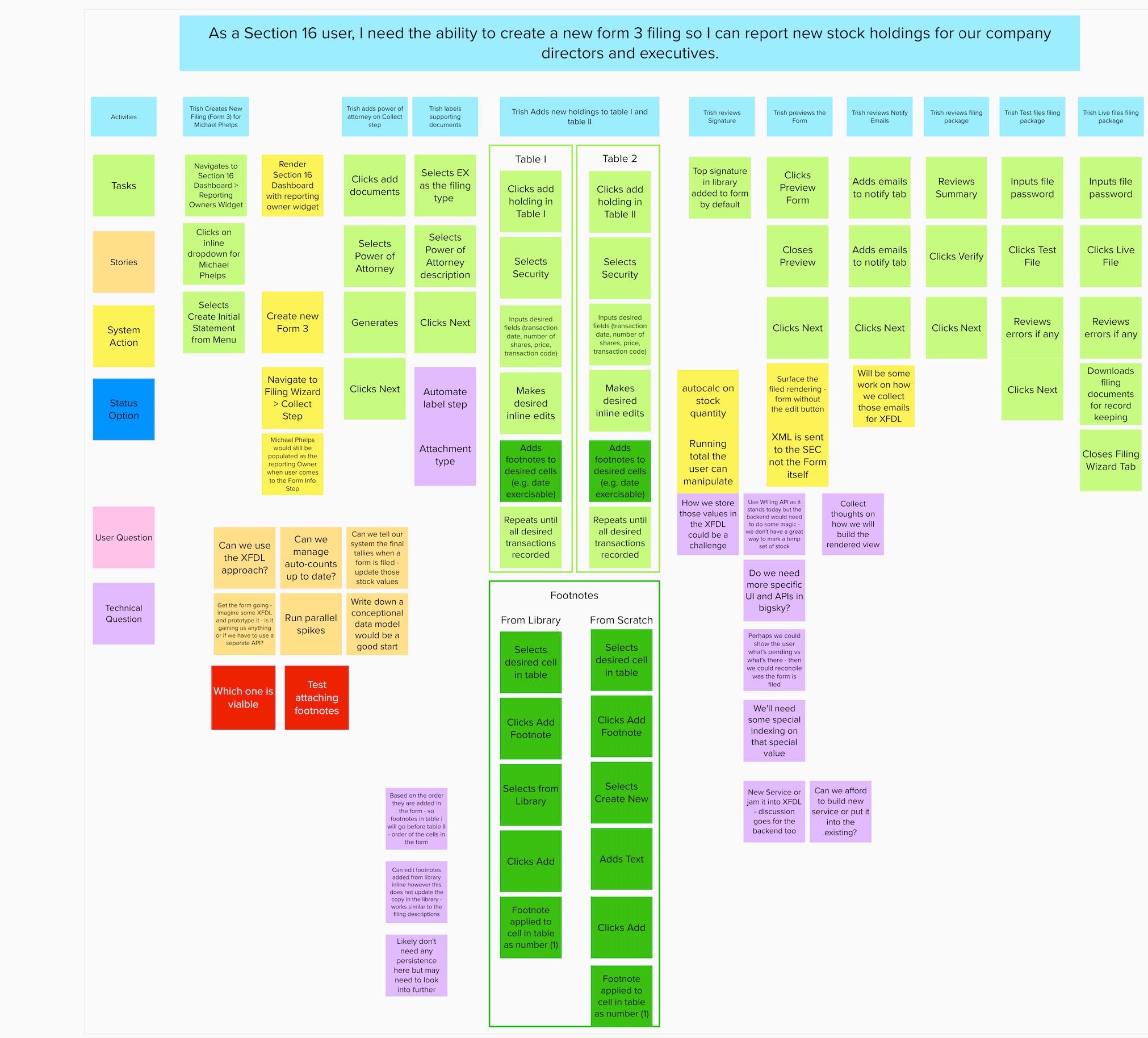
Once an initial workflow was identified, I facilitated a more detailed user journey workshop to identify stories, potential gotchas and tech spikes needed to get the project moving.
I also wanted to get moving on some lo-fi designs so we could begin early user validation.
We spent a lot of time discussing adding transactions and footnotes within the form experience so I wanted to include that in our initial designs along with validating moving the form filing experience to the Workiva filing wizard was the right move.
WIREFRAMES AND PROTOTYPES
I began working on lo-fi designs with the following goals in mind:
- Understand the impact of moving the Section 16 forms to our NextGen filing wizard
- Understand the impact of changing the data dense tables in each of the forms to more visually pleasing design would have on our user's workflow
- Understand what impact moving the footnotes experience from a modal to a panel experience would have on our user's workflow
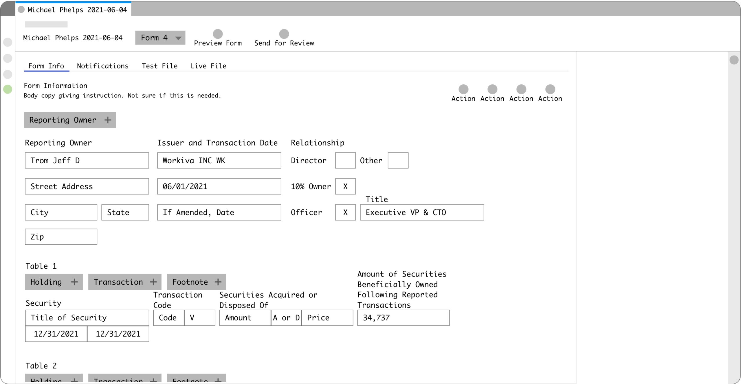
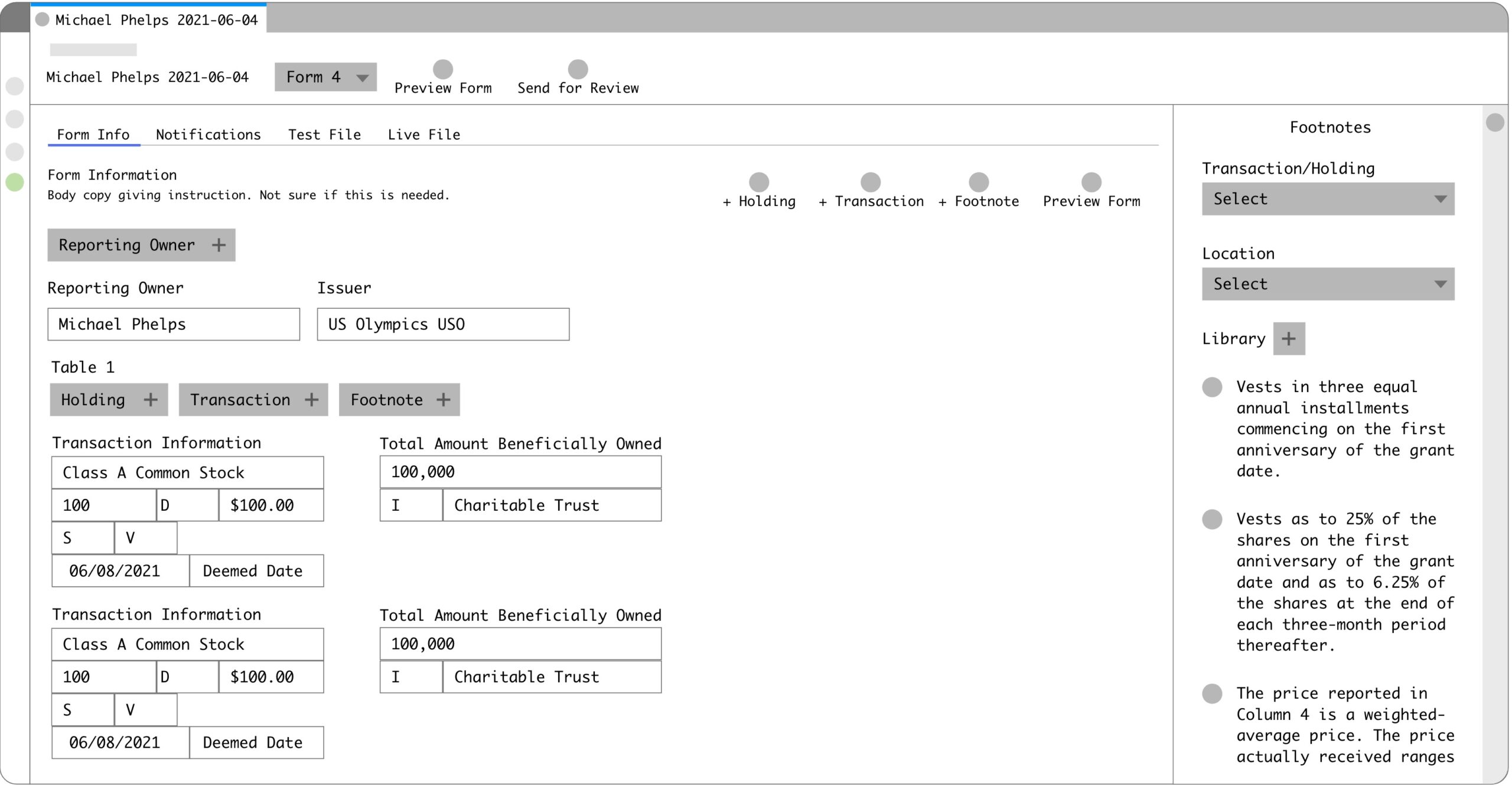
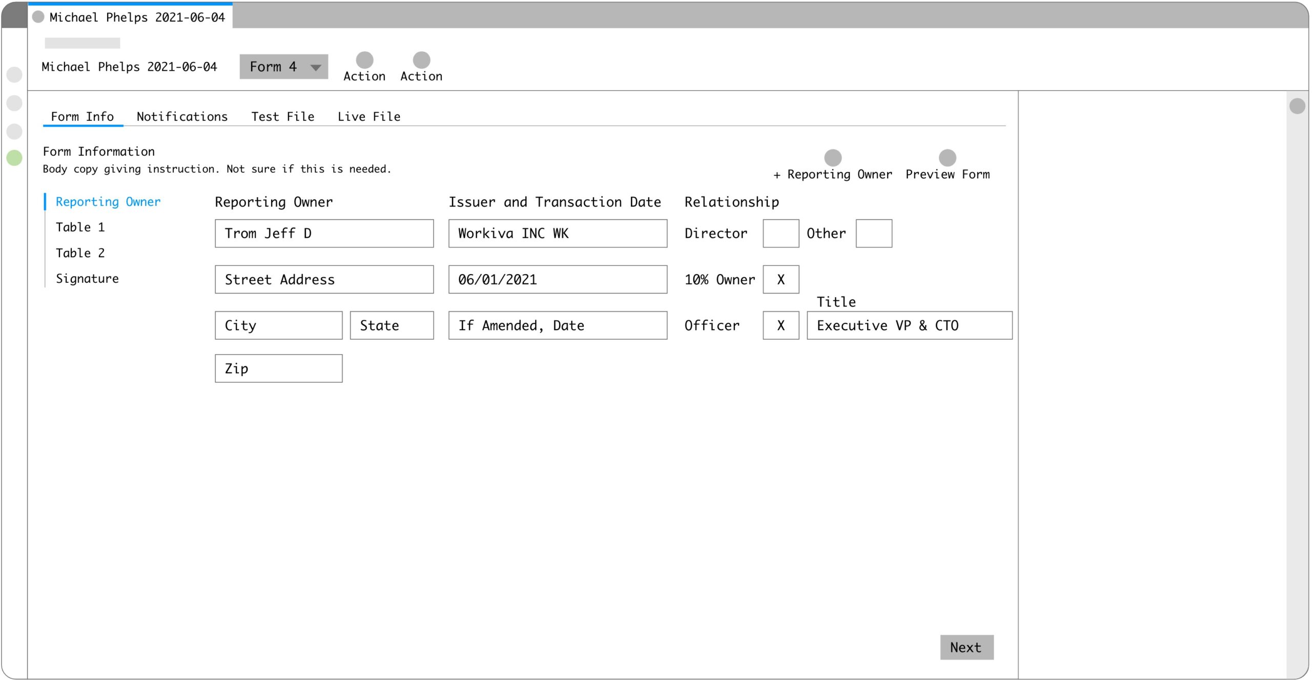
Initial ideas on the Form 4 were mocked up. I focused on the grouping of the transactions to see if we could use a different layout than a table.
I also wanted to validate some ideas we had for the footnotes interaction. I chose to display them in a panel vs a modal as it allows the user to view the main content area.
Moving the Section 16 Forms into the filing wizard experience was a critical peice to streamlining the workflow. Wanted to get feedback on how users might move through.
Findings from the initial round of designs showed:
- Users loved the idea of bringing the forms into the NextGen filing wizard as that's familiar to them (how all other SEC filings are submitted in Workiva)
- Users loved having the separate test file and live file steps as this was hard to keep track of in the Classic experience
- Users were onboard with having footnotes in a panel as it would allow them to see the main content area and continue to work
- Users were NOT onboard with changing to a new visually pleasing asthetic vs the tables
- They want to see all of the content in the tables (headers and row values)
- They prefer the data dense view
Based on these findings I moved to hi-fi set of designs using Workiva standard design system components.
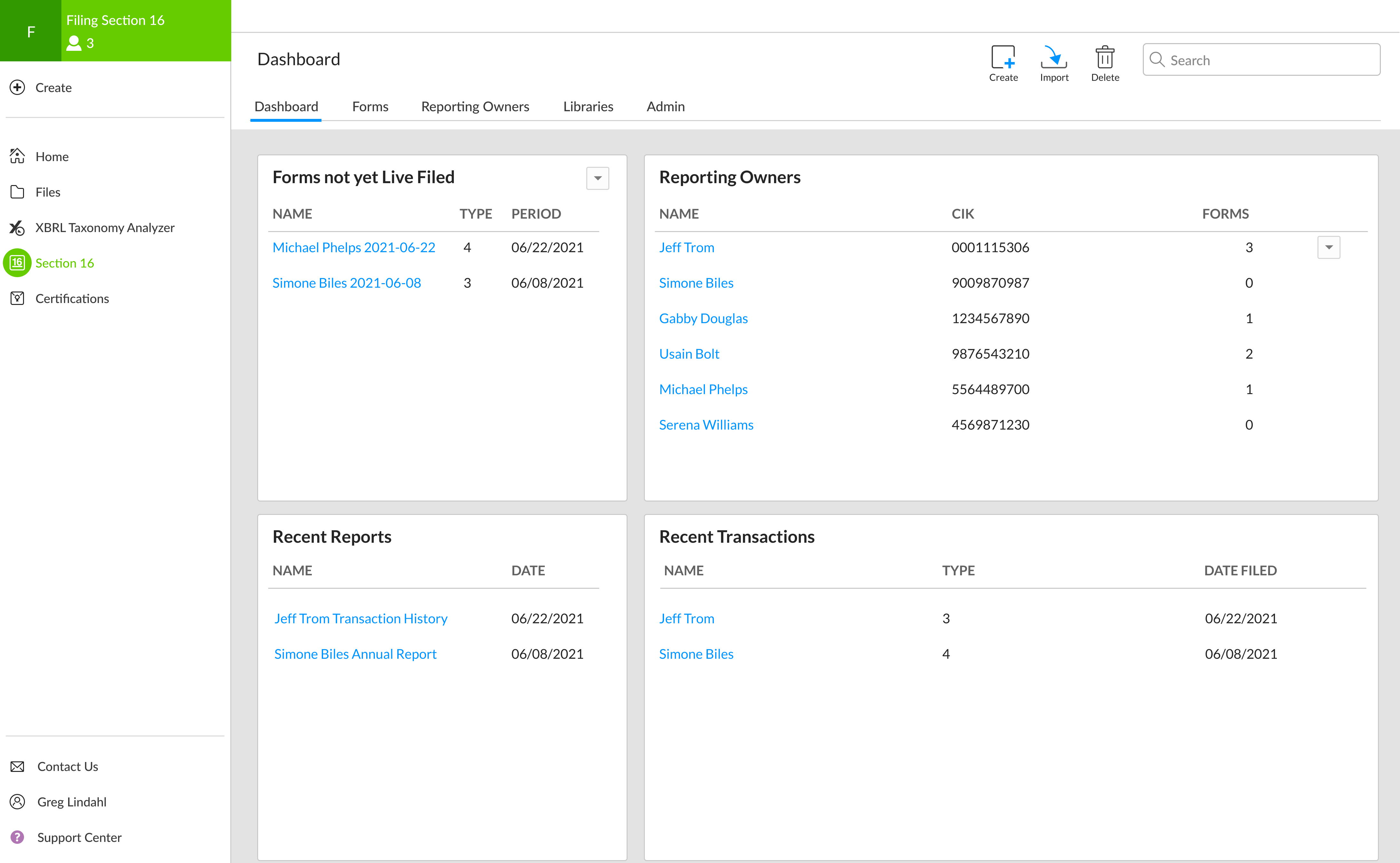
We also learned from our initial discovery calls that users prefer to enter the application from a dashboard. They typically start by creating a new form for a reporting owner. As we wanted to keep the features our customers loved, I kept the dashboard in my initial hi-fi designs.
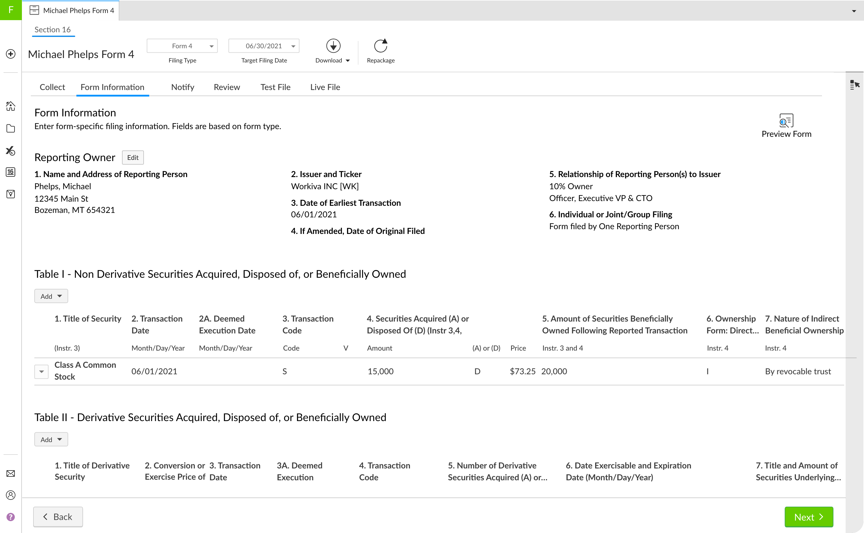
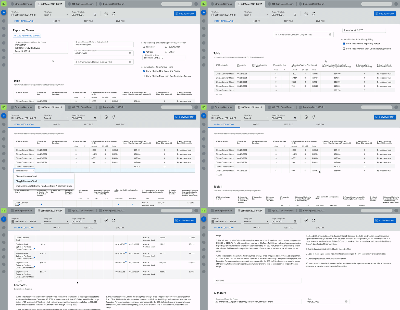
Getting feedback on the table layout within the form was also top of our list. Users expressed wanting to see the entire table in one view which posed an aesthetic challenge due to the high number of columns and data in each row. This was very important to our legal customers.
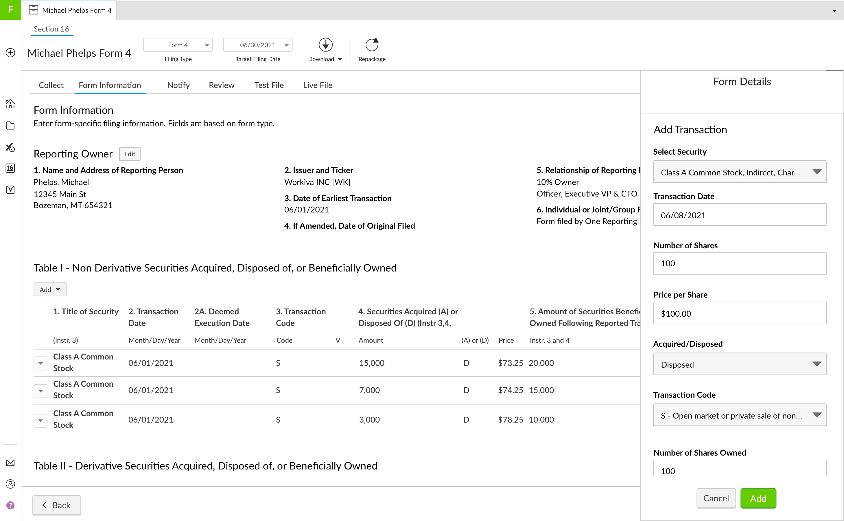
Along with footnotes, I presented adding a new row (transaction) via a right hand panel to see how it would impact user workflow. Users expressed how they liked the interaction in Classic which used a modal to add a new row but perform any edits inline. I felt the panel was a better choice as they could still view the main content area.
The next round of design validation gave the team some great insights. Users again expressed delight with moving the form experience into the filing wizard to streamline the workflow. They especially apprecaited the separate test and live file steps and that it was familair, as that's how our other SEC filings are done.
However we ran into some issues with the form design itself. I highlighted some of the challenges for the team in our synthesis workshop. While users felt the design worked, it didn't "wow" them like the other recommended changes.
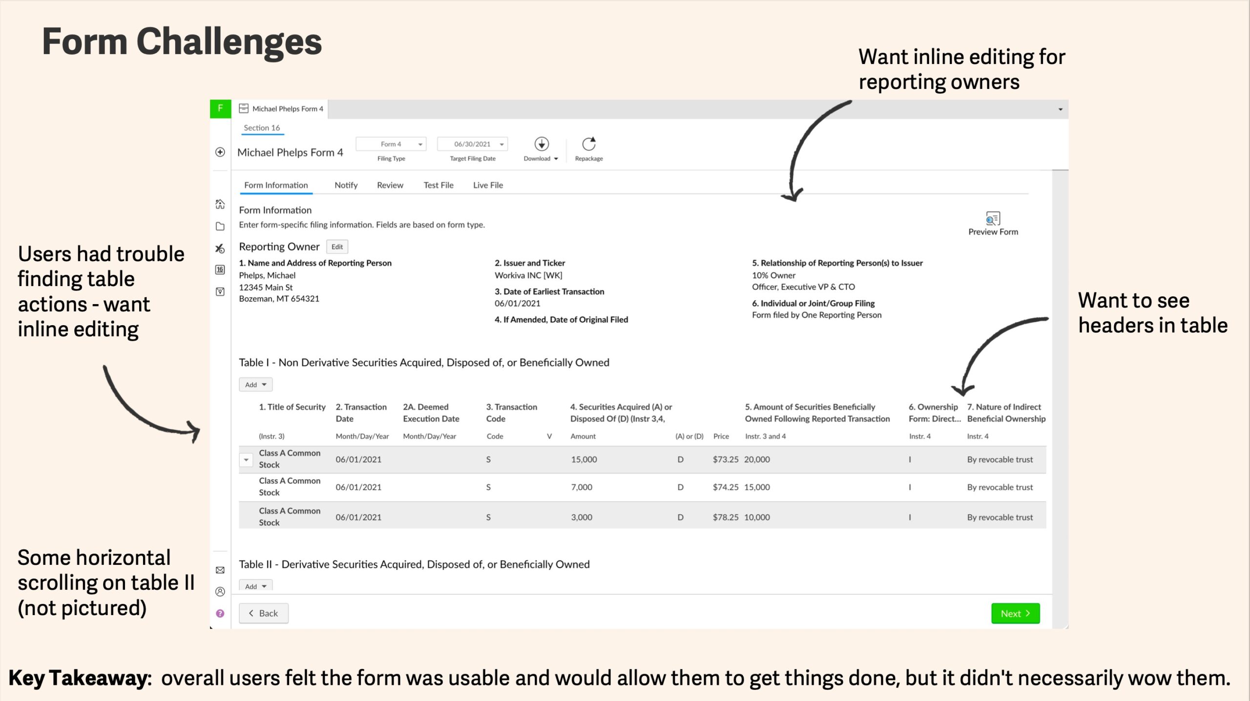
Thinking on how we might push the design further I recommended doing another iteration using our Material Design inspired components coming to production second half of next year. We wanted to address the following challenges that we couldn't necessarily address with our current components without a ton of customization.
Table Challenges:
- dense data, many columns
- long headers with the desire to see it all
- users prefer inline (in table) editing of data
- this table grows to 30+ rows
- horizontal scrolling didn’t test well
FORM EXPERIENCE
Using the Material inspired components, the design approach around tables consisted of:
- optimizing tables for dense data and actions
- increasing scanability with alt row fill
- leveraging dense sizing to accomodate for long headers and data
- surfacing primary actions where appropriate
- adding inline edits for optimal user workflow
- using elevation to center user's focus
FOOTNOTES AND FORM PREIVEW
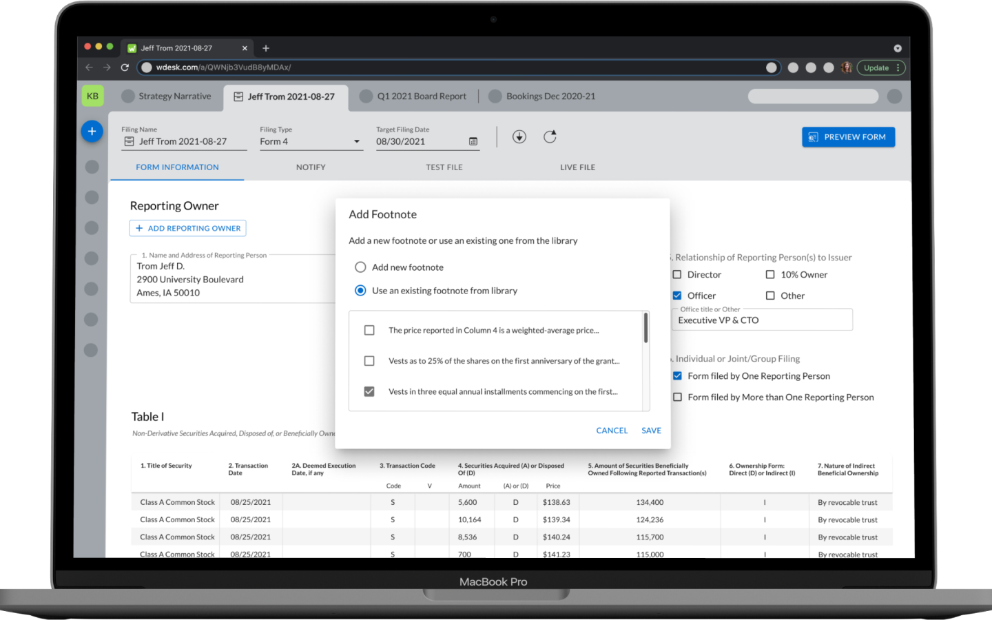
The footnotes interaction was eventually moved back to a modal after we discovered in our last stage of user validation the desire to move the window around within the main content area.
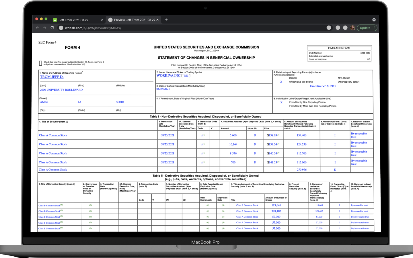
Lastly we included a live preview of the form as it would appear on the SEC website after filing. Users expressed the need for confidence in the numbers being filed and the live preview enabled them to double check the work prior to filing with the SEC.
SUCCESS METRICS
- All Section 16 customers can file without Customer Success intervention
- Customer satisfaction scores improve or remain equivalent to the Classic experience
NEXT STEPS
- Design workflow to enable users to bulk upload transactions from an external system
- Design workflow to enable users to connect to external brokerage systems and pull data into Workiva to reduce manually adding transactions
SELECTED WORKS
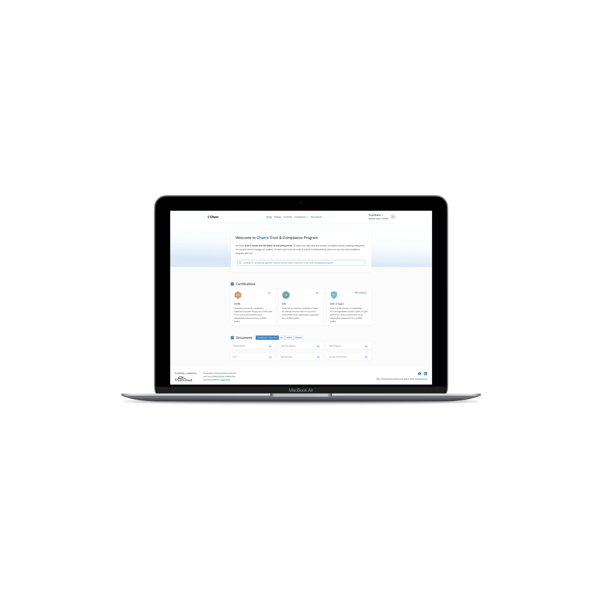
TrustShare Portal and Deal TrackerApplication Design
API Integration ApplicationEnterprise App Design
Cloud Elements Help CenterWebsite Design
Data ModelerApp Design

Reading RecordiOS Design
Get in Touch