CLOUD ELEMENTS HELP CENTER
COMPANY
Cloud Elements
MY ROLE
Lead UX Designer
SUMMARY
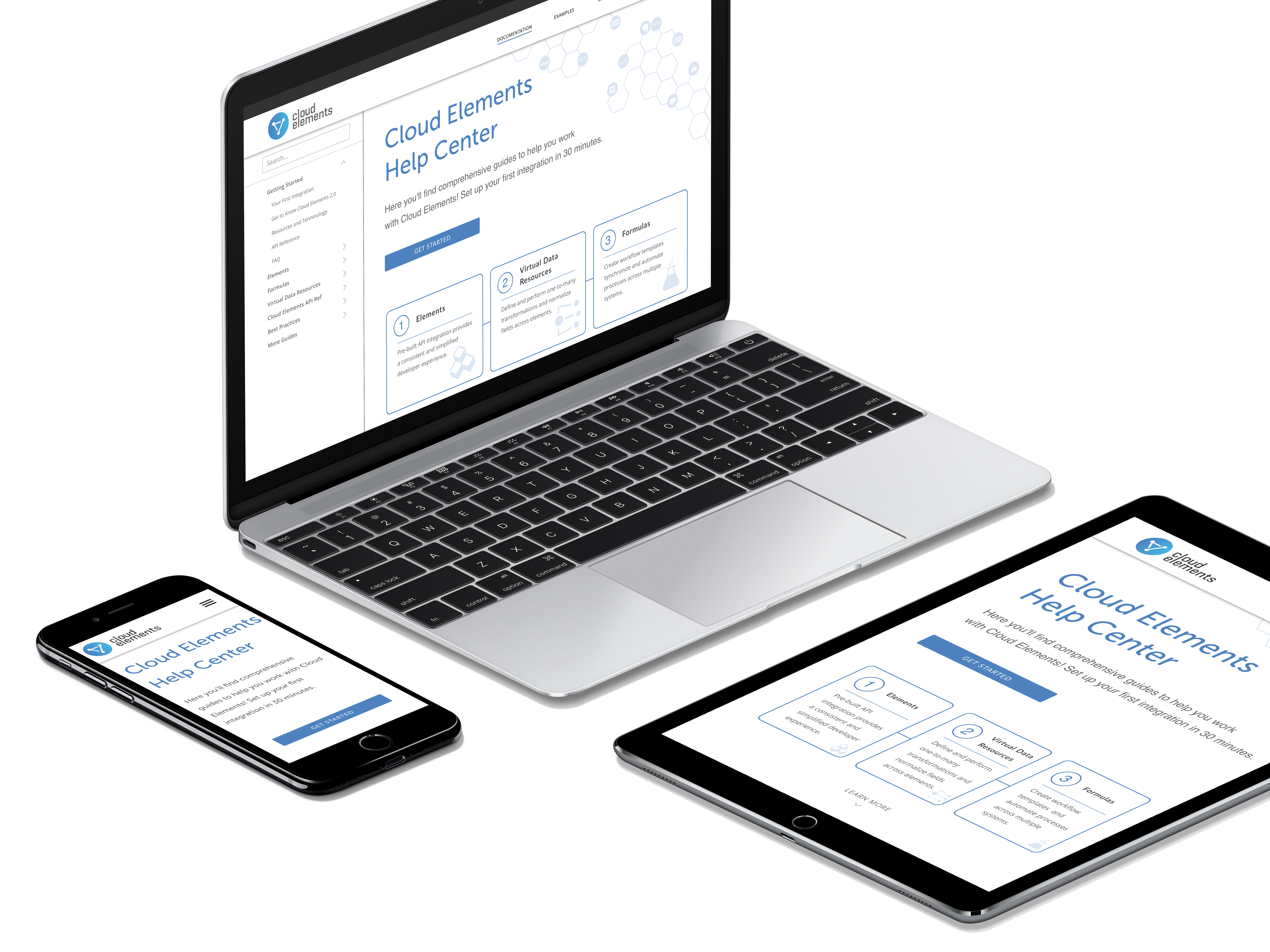
I lead the design for the Cloud Elements Help Center experience.
ABOUT THE COMPANY
Cloud Elements is a cloud API integration platform that enables developers to publish, integrate, aggregate, and manage all of their APIs through a unified platform. The API integration platform offers prebuilt connectors to cloud services where users can connect services, model data, and orchestrate data. They believe in an API first approach. However in order to expand to new markets, a UI to build end-to-end integrations was needed.
BUSINESS PROBLEM
The Cloud Elements Help Center was intended to provide a central location for customers to reference how to use the Cloud Elements API platform in their applications.
We have observed that the current version of the documentation does not provide clear direction or provide the level of detail and reference required by our customers to be successful. This user pain and confusion increases risk of losing potential and current customers through decreased usage of our product.
How might we create a documentation experience where developers can quickly learn about the API platform?
SOLUTION
Design an experience that provides clear navigation and guidance throughout the entire website. The help center will consist of API documentation, as well as, guides to assist users in building integrations using the Cloud Elements Platform.
PROJECT GOALS
- Inform user and provide guidance
- provide a clear method of finding a desired page
- present a scannable and digestible layout
RESPONSIBILITIES
- managing UX designers
- conducting user research
- facilitating Lean UX design workshop
- working on competitive analysis
- conducting user interviews
- designing information architecture
- wireframing
- user testing
- prototyping
- coding HTML, CSS, and jQuery
- writing UX copy
- facilitating upward reporting to key stakeholders
PROCESS
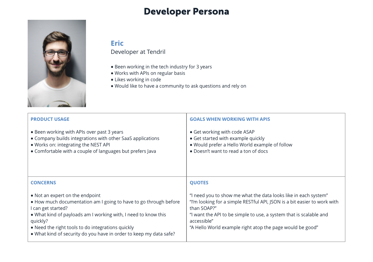
The design process started by defining high level business outcomes, user persona, hypothesis, and next steps with key stakeholders from product, engineering, sales, and leadership. The team began building out the developer persona, as well as, conducting a competitive analysis of other products.
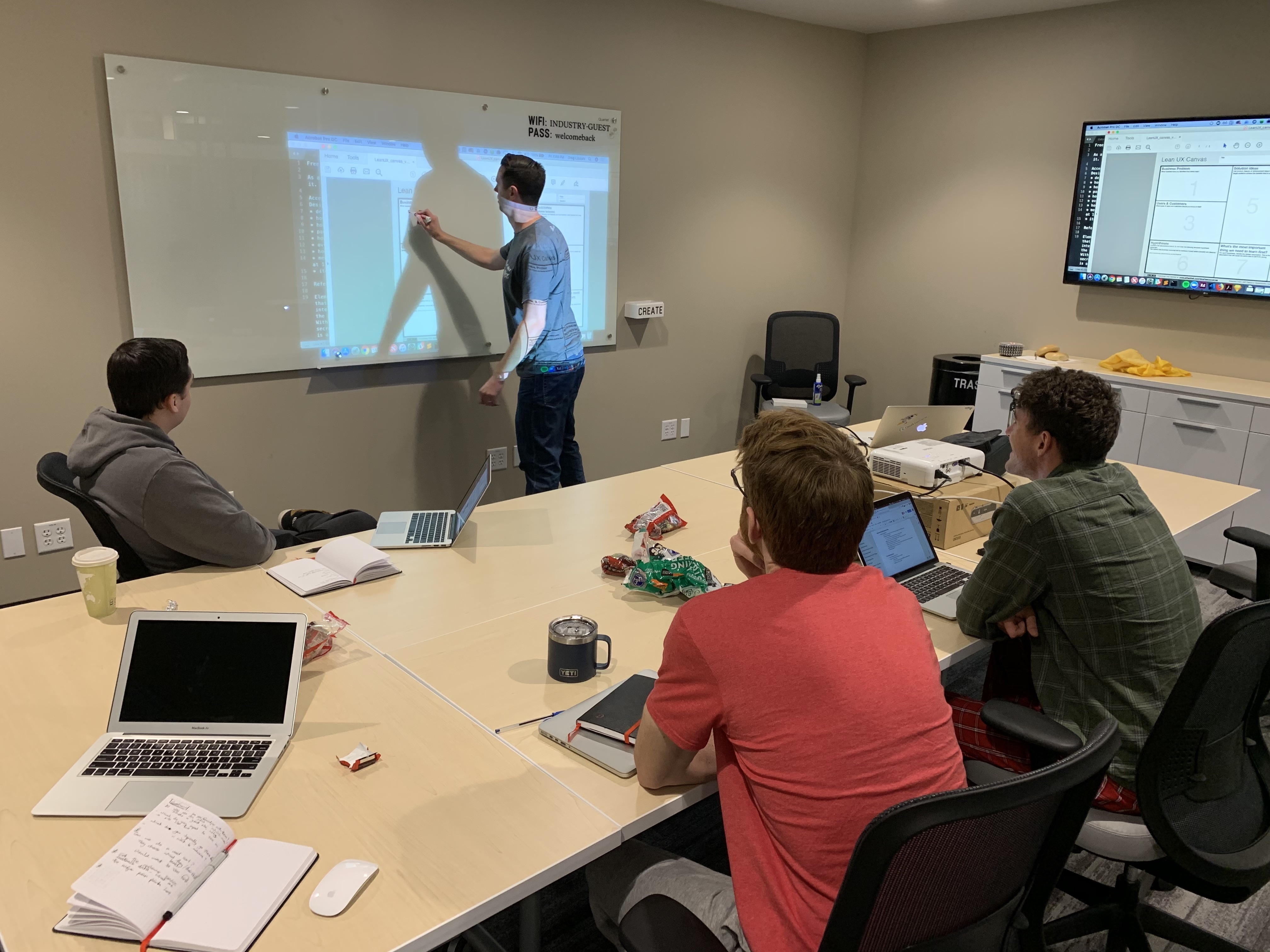
I faciliated a Lean UX canvas session to set goals for the design team.
The canvas also provides a point of reference throughout the design process to remind the team of user goals and outcomes.
Developers are often tasked with building the integrations without having much choice in the tool. They need to get up to speed on the Cloud Elements Platform quickly in order to be sucessful.
In doing research and discovery it was clear that developers do not want to read a ton of documentation. They want to know the quickest way to 'Hello World'.
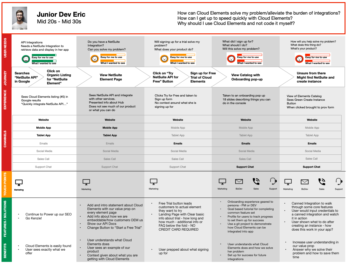
When researching the user journey, developers became frustrated early with the lack of guidance and having to dig through lots of documentation to find what they needed.
Cloud Elements Help Center was causing more frustration than anything due to the vast number of guides and lack of organization.
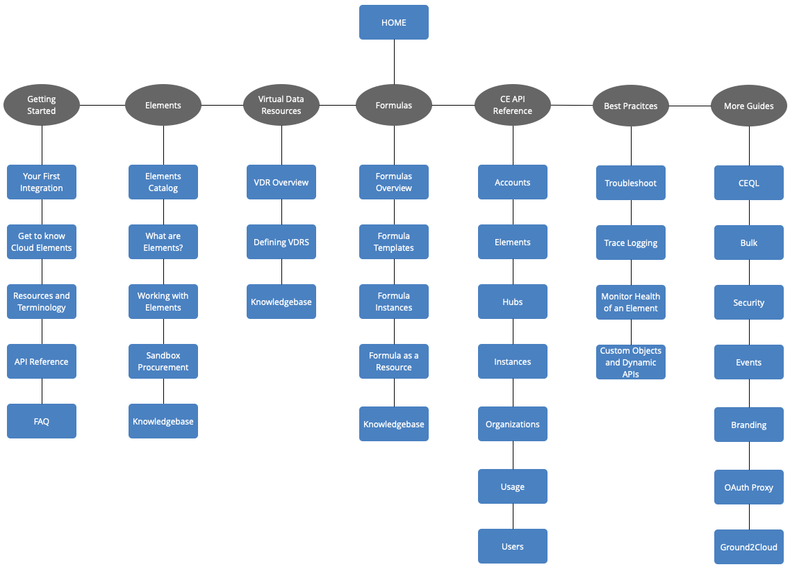
There were 12 categories on the current version of the help center. Working with product, the categories were resturctured to seven. User testing help validate this was structure was more clear.
WIREFRAMES AND PROTOTYPES
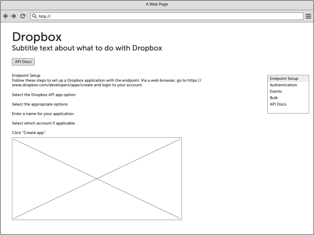

Initial ideas were brought to life using Balsamiq in order to test layout and possible content structure.
User testing was held often to validate layout and possible user flows. Iterations were made based on the feedback from these sessions.
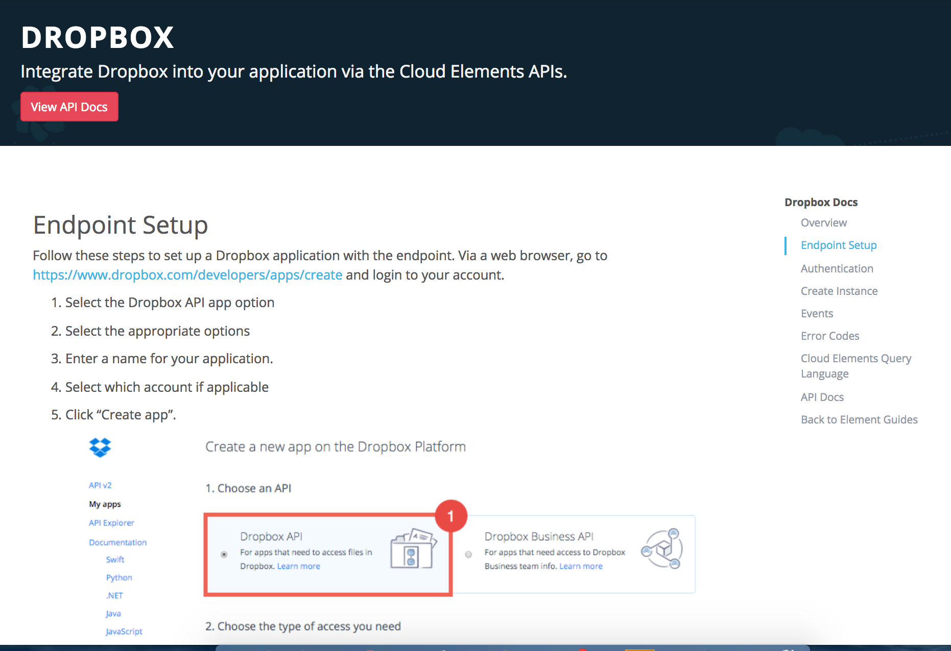
Wireframes were taken to hifi mockups and eventually clickable prototypes using Bootstrap. The branding was updated later to match the Cloud Elements style guide.


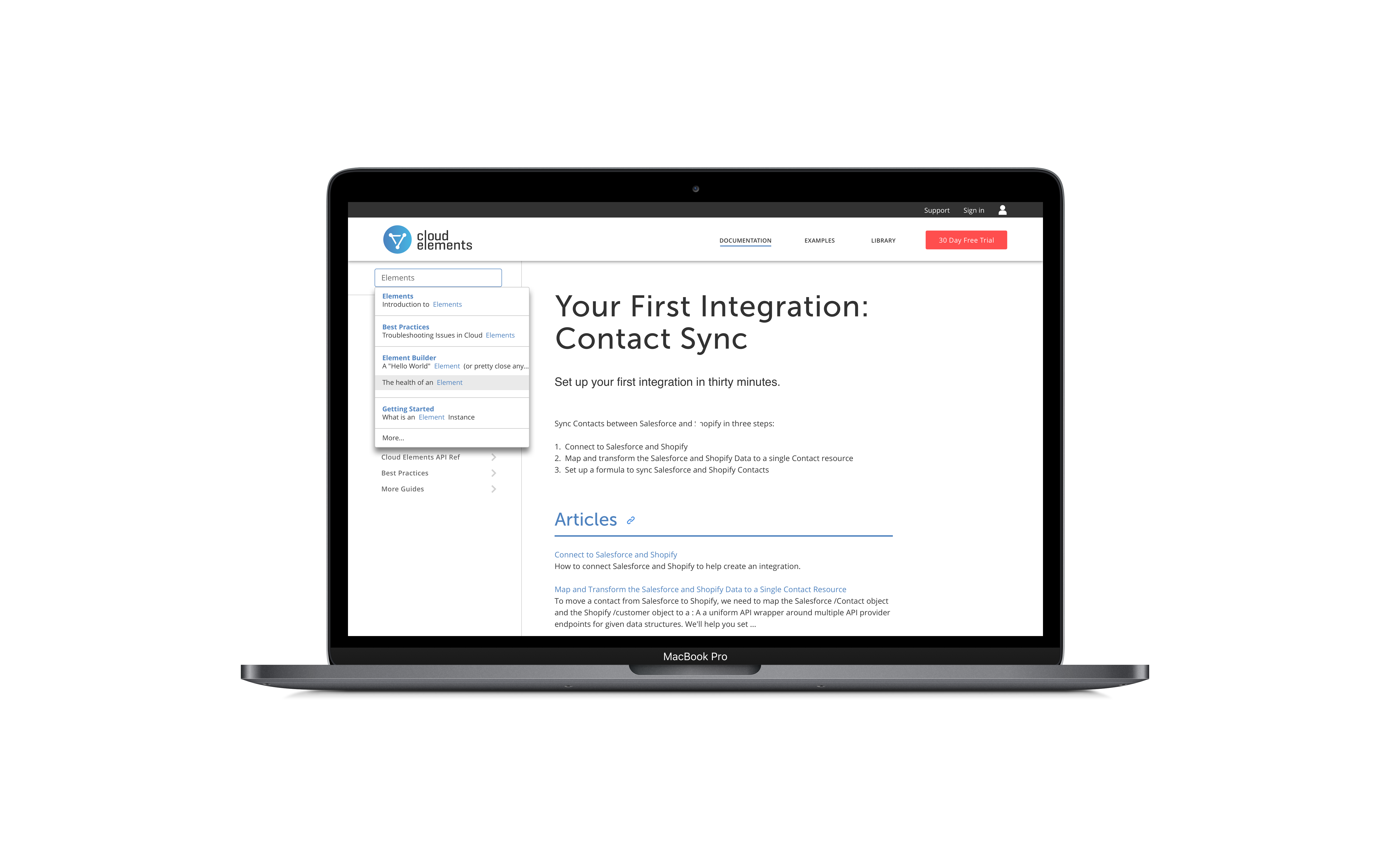
HOME PAGE AND SEARCH
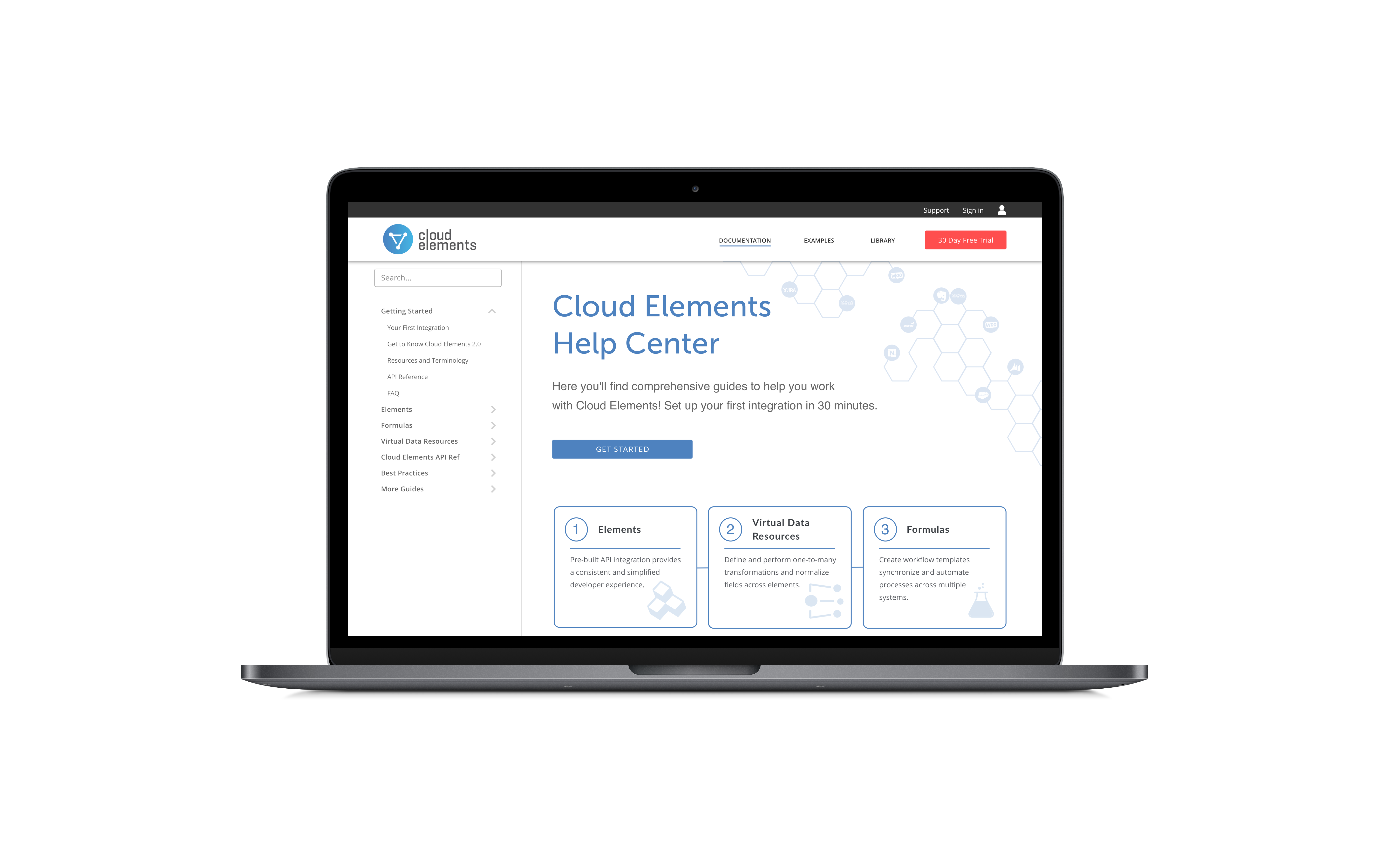
The homepage was designed with a clear Call to Action at the top with the option to explore more below the fold. This design choice is targeting first time users.
A global search and left hand navigation was also added so the user could easily navigate to any page within the site from any point in the user flow. This design choice is targeting returning users that need to jump to a particular document quickly.
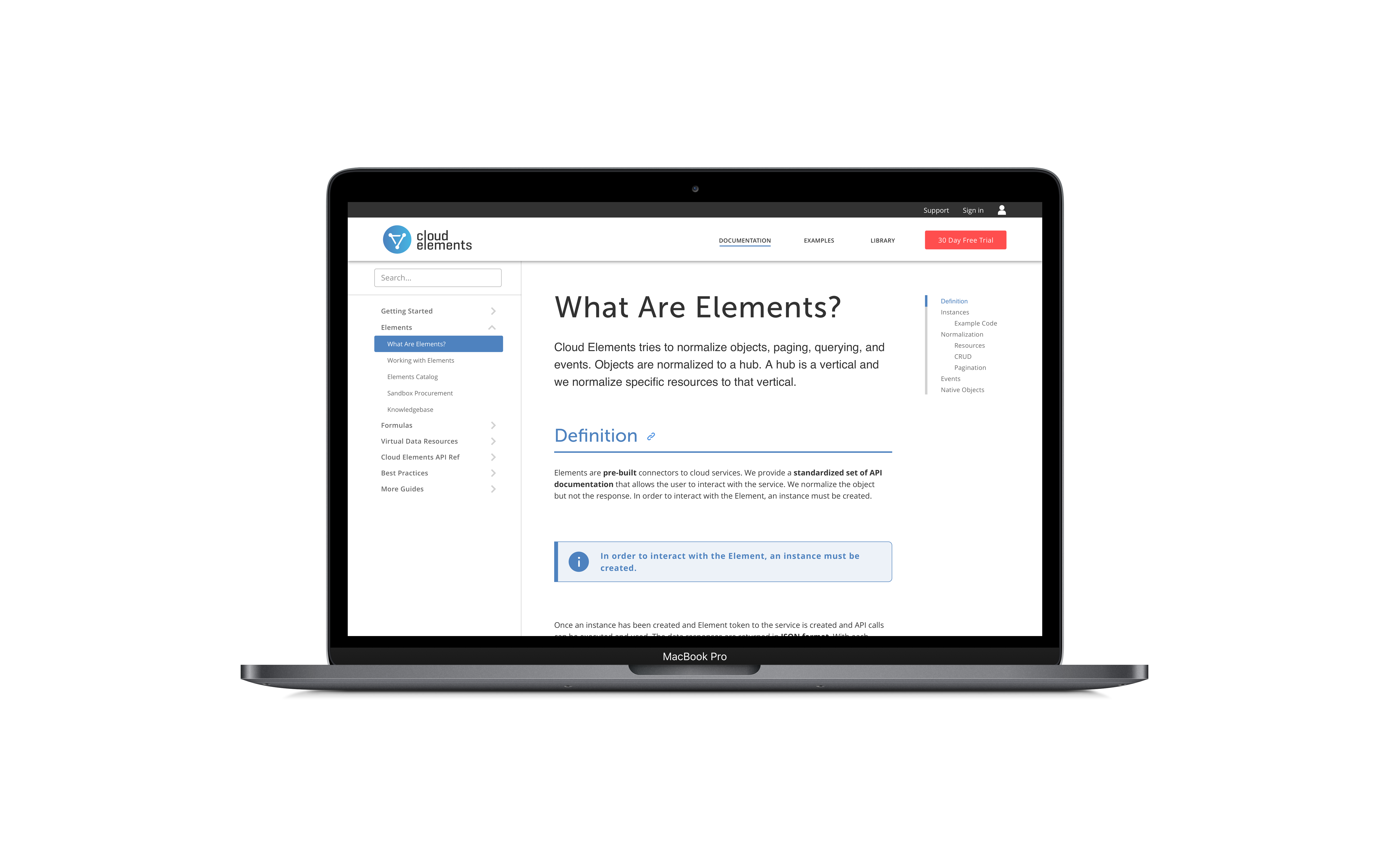
REFERENCE GUIDE DESIGN
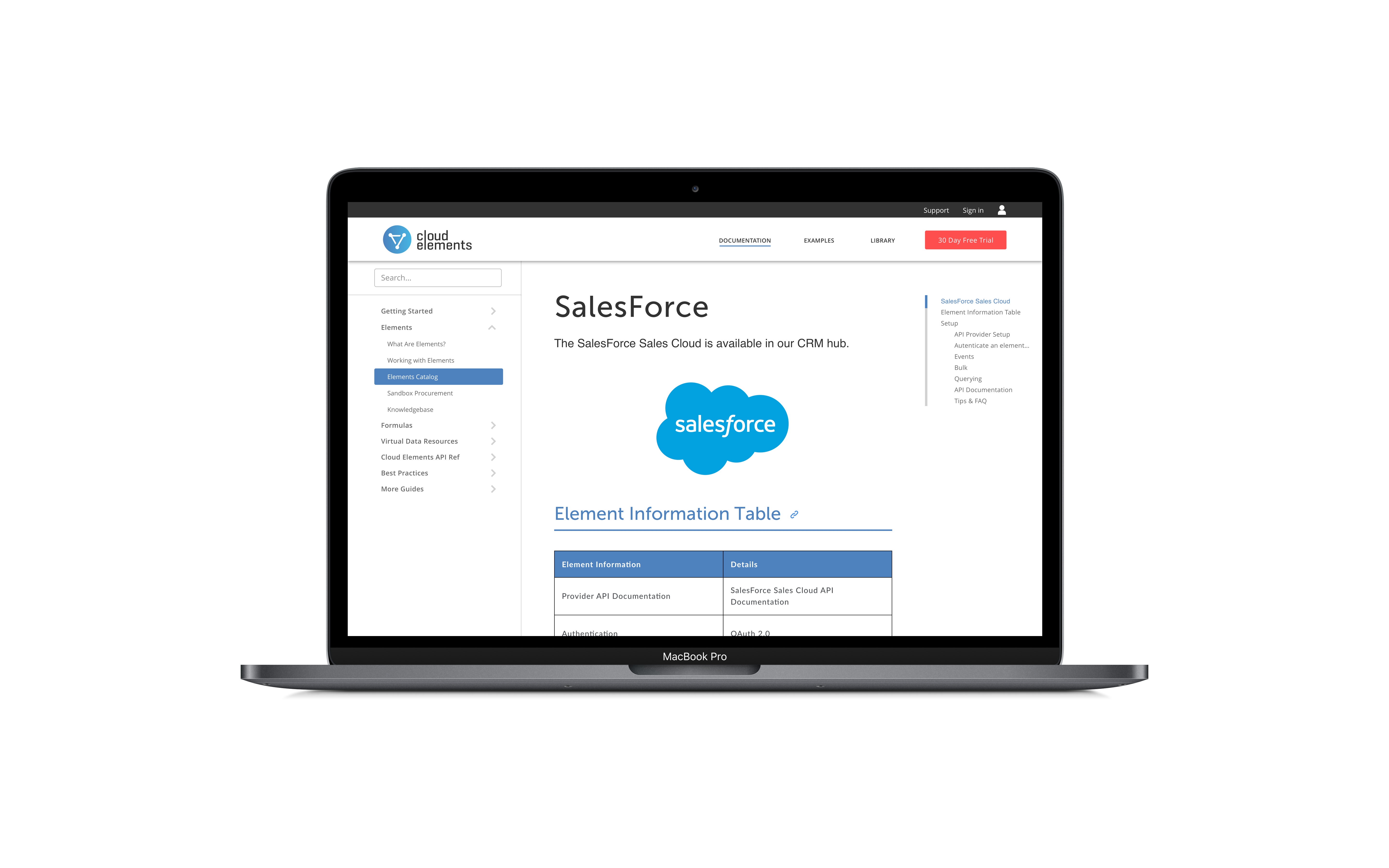
We received feedback from the discovery phase that the guide structure was hard to scan and navigate. Based on this feedback a right hand navigation was added so users could quickly scan the headers of an article, as well as, jump to a particular spot in the documentation.
Tips and tricks were given a standard design along with block quotes and images to provide a consistent user experience for every guide within the help center.


ELEMENTS CATALOG
Elements are the building blocks to the Cloud Elements API platform. An Element is a prebuilt API integration that enables a connection into a specific cloud application or cloud service endpoint (e.g., Box, Salesforce.com). Elements provide a variety of advanced features built in including normalized authentication, discovery APIs, search capabilities, event-driven workflows, and unified error handling.
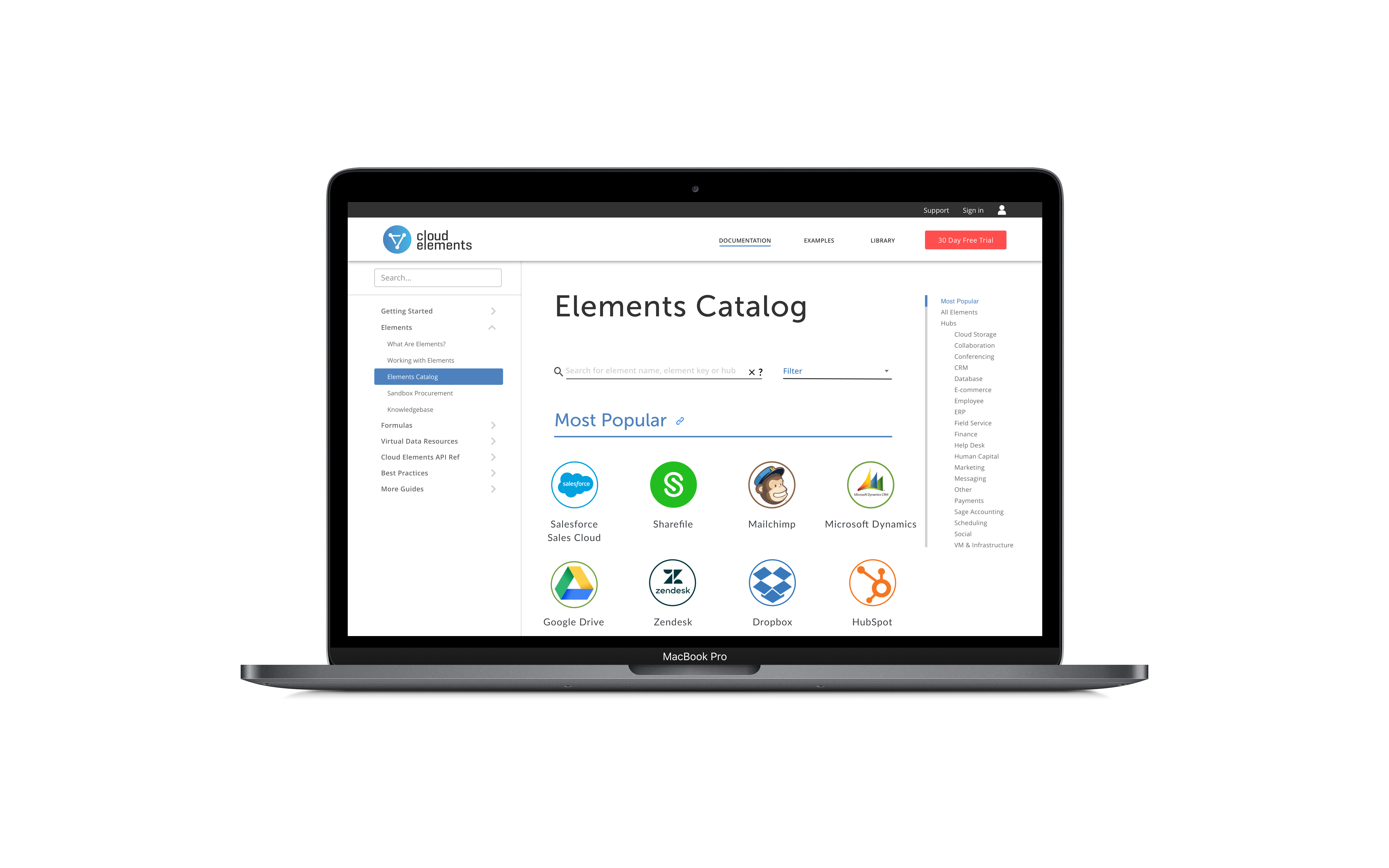
Developers need to be able to find Element documentation quickly. The previous version of the Help Center made it difficult to navigate the list of Elements by rendering them as a list of child categories. This forced the user to scroll through the list to try and find the desired Element.
Search and filtering was added to the Elements Catalog page to better assist the user in finding items quickly. The children were removed from the left hand navigation as well.
ACHIEVED METRICS
- Decreased support tickets filed for no or lack of documentation by 25%
- Increased number of customers completing first integration per month without support by 15%
NEXT STEPS
- Enhance Element API documentation experience
- Provide mechanism for users to save articles and snippets to profile
- Design a forum experience for further user collaboration and discussion
SELECTED WORKS

Section 16 ReportingApplication Design

TrustShare Portal and Deal TrackerApplication Design
API Integration ApplicationEnterprise App Design
Data ModelerApp Design

Reading RecordiOS Design
Get in Touch