
COMPANY
UMI Limited
MY ROLE
UX Designer and Co-founder
SUMMARY
I designed the user experience for the Reading Record application. The app provides an effective medium to quickly assess and track student progress.
ABOUT THE COMPANY
UMI provided design and development services for web and iOS platforms. Along with the Reading Record application, I designed a number of websites for schools and a reading program called CR Success. We were a small shop of just 3 people. Projects were completed on nights and weekends as I was still teaching full time when we started the comapny. After 3 years we dissolved the company when I moved into a full time UX designer role.

BUSINESS PROBLEM
Teachers are constantly being asked to monitor student progress in reading instruction to build a body of evidence for each student. They are to perform reading fluency tests on each student twice a week, 2 per student, per week. This also requires time to be spent on filing and manual record keeping.
How might we provide teachers with a means to test, track, and collect reading data on students electronically?
SOLUTION
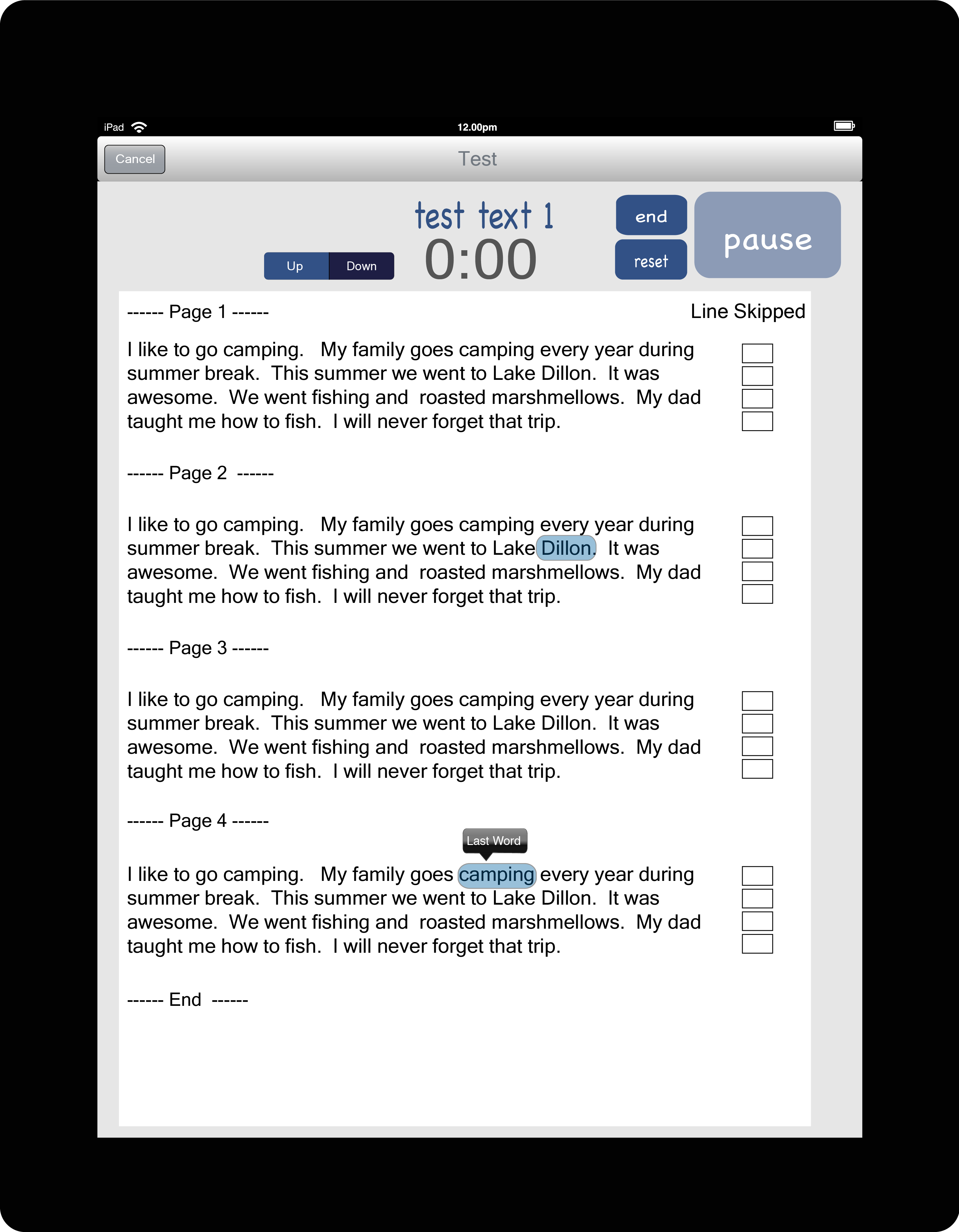
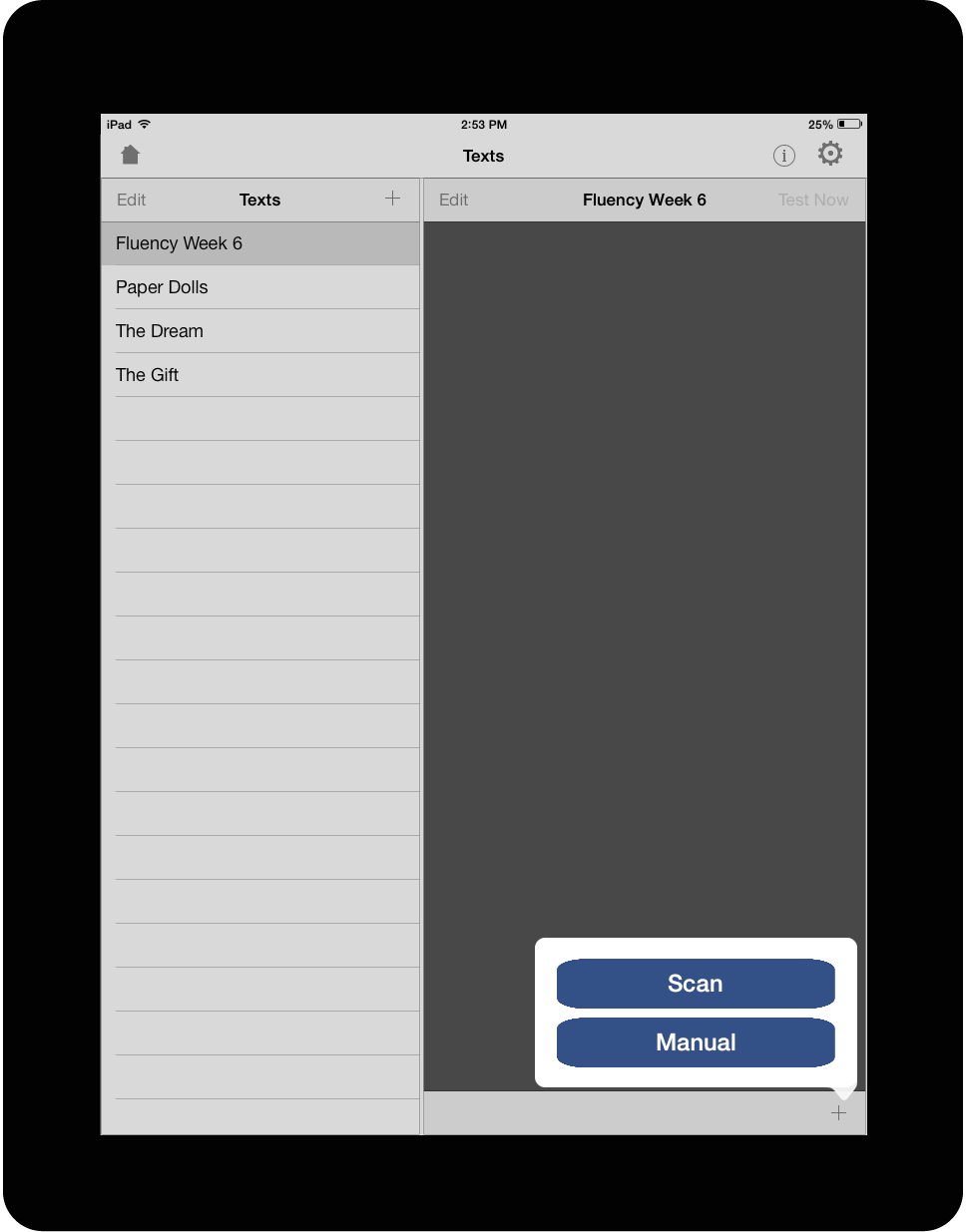
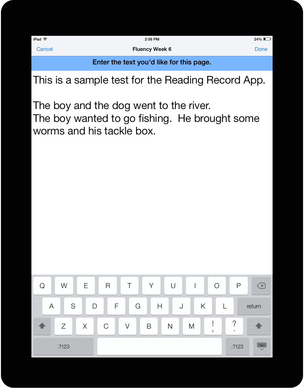
The Reading Record App provides an effective medium to quickly assess and track student progress. Texts can be scanned right into the iPad. Students can be tested on these texts right from the iPad.
PROJECT GOALS
- decrease administrative time teachers take around test prep and grading by 30%
- increase one-on-one testing time with students
- create resuable tests for the following year
RESPONSIBILITIES
- heirsitic analysis
- collaborating with two full stack developers
- conducting user research, interviews, discovery, and competitive analysis
- designing information architecture
- wireframing
- user testing
- prototyping
- writing UX copy
- coding HTML, CSS, and JavaScript for public website
PROCESS
The design process started by doing research on how much time teachers were wasting with administrative duties in regards to testing and grading. I began collecting user data via interviews and observations. Next I wanted to make sure that uploading texts to the iPad would actually save time and would teachers find it valuable.

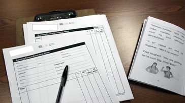
I interviewed teachers to gather data around testing and administration.
The current way to administering a running record (1 minute timed test on a piece of text). Teachers spent an average of 10 hours a week just making copies of the test and text.
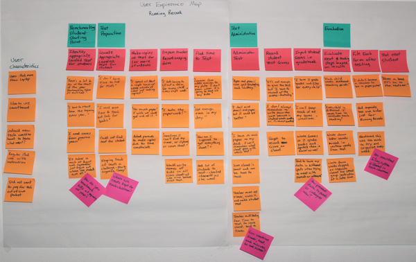
I began sorting out tasks to create a user journey map based on the data collected.
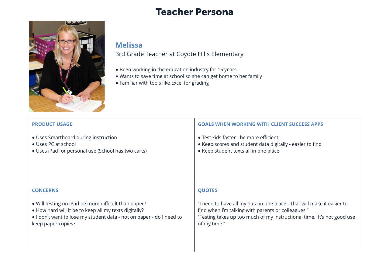
Based on my interviews and discovery time, teachers are always pressed for time. They are trying to get through all planned lesson work while doing their best to squeeze in testing time to already packed day.
After the students go home, they spend an average of 2 hours a day grading and prepping for the next day. It would be a huge benefit if we can save them some time during the day.
WIREFRAMES AND PROTOTYPES
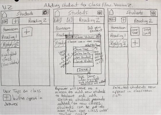
I started with paper sketches to get some ideas visualized. I used these sketches to run some user testing and clarify any assumptions and gotchas.
Based on feedback collected, I made iterations and took them to hifi mockups.


ADMINISTRATION
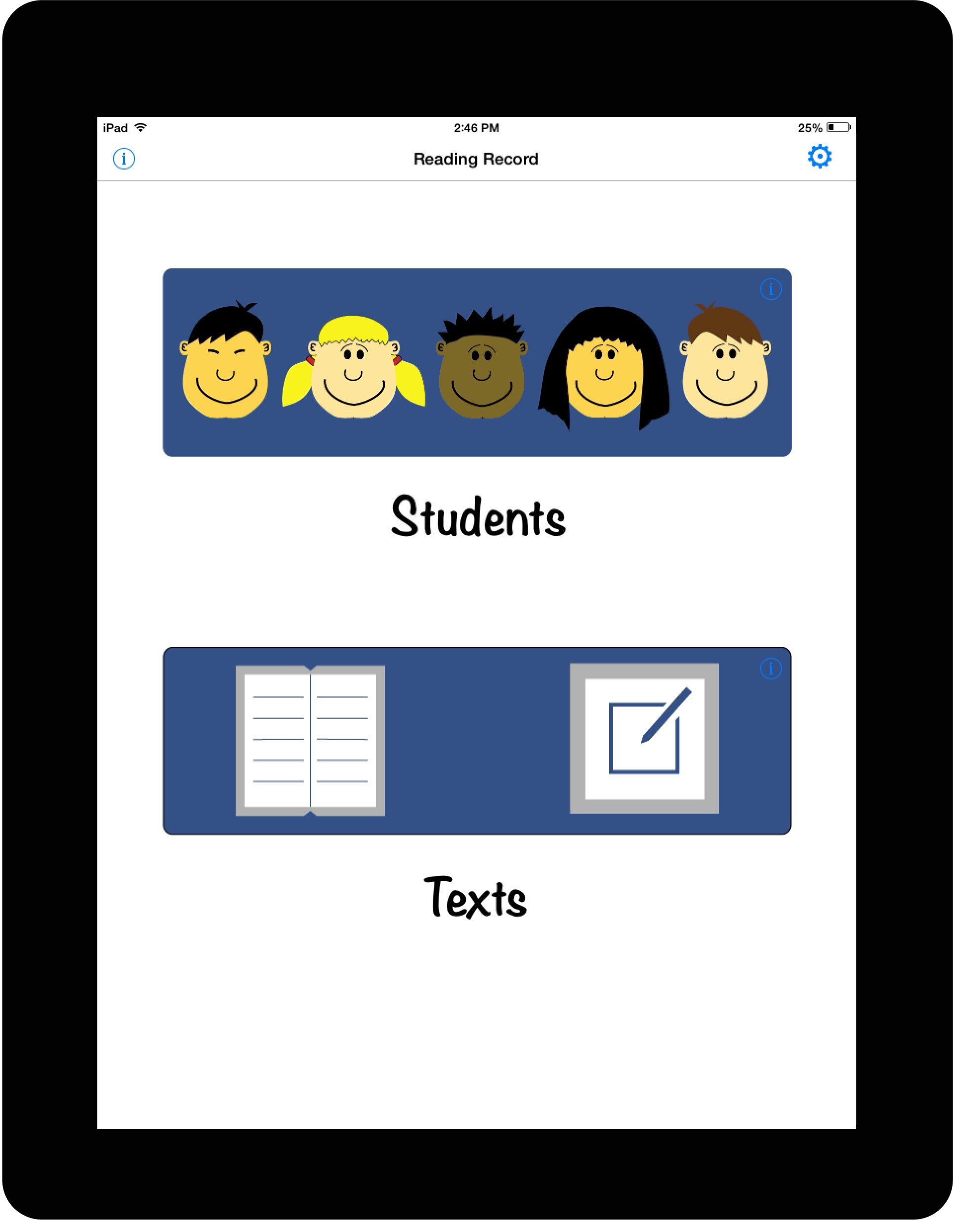
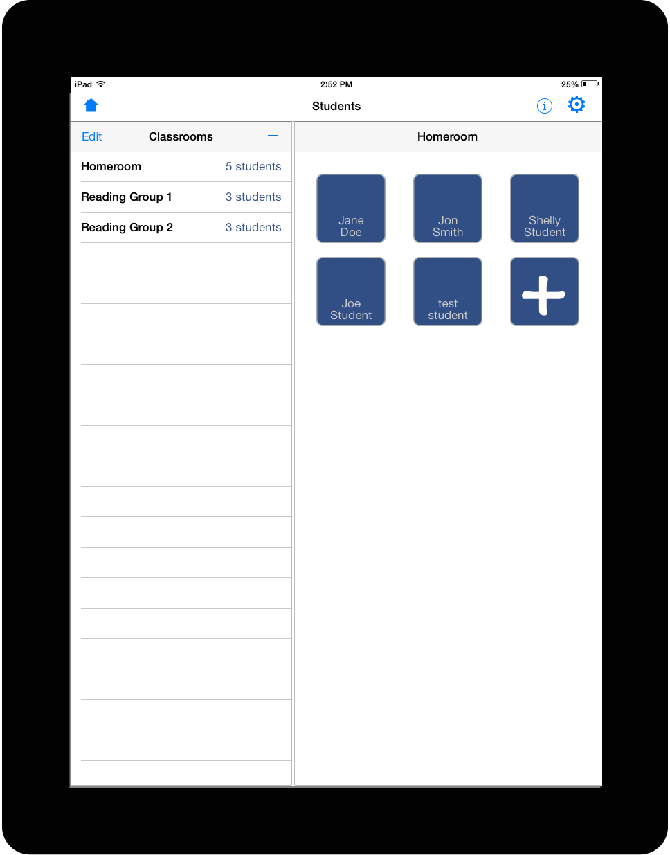
Teachers can quickly add and manage new students. This view gives the ability to group students together. Teachers can quickly navigate among groups, as well as, manage students.
Tests can also be added via the scan feature. Using the iPad camera, snap a picture of the desired text for upload.
TESTING
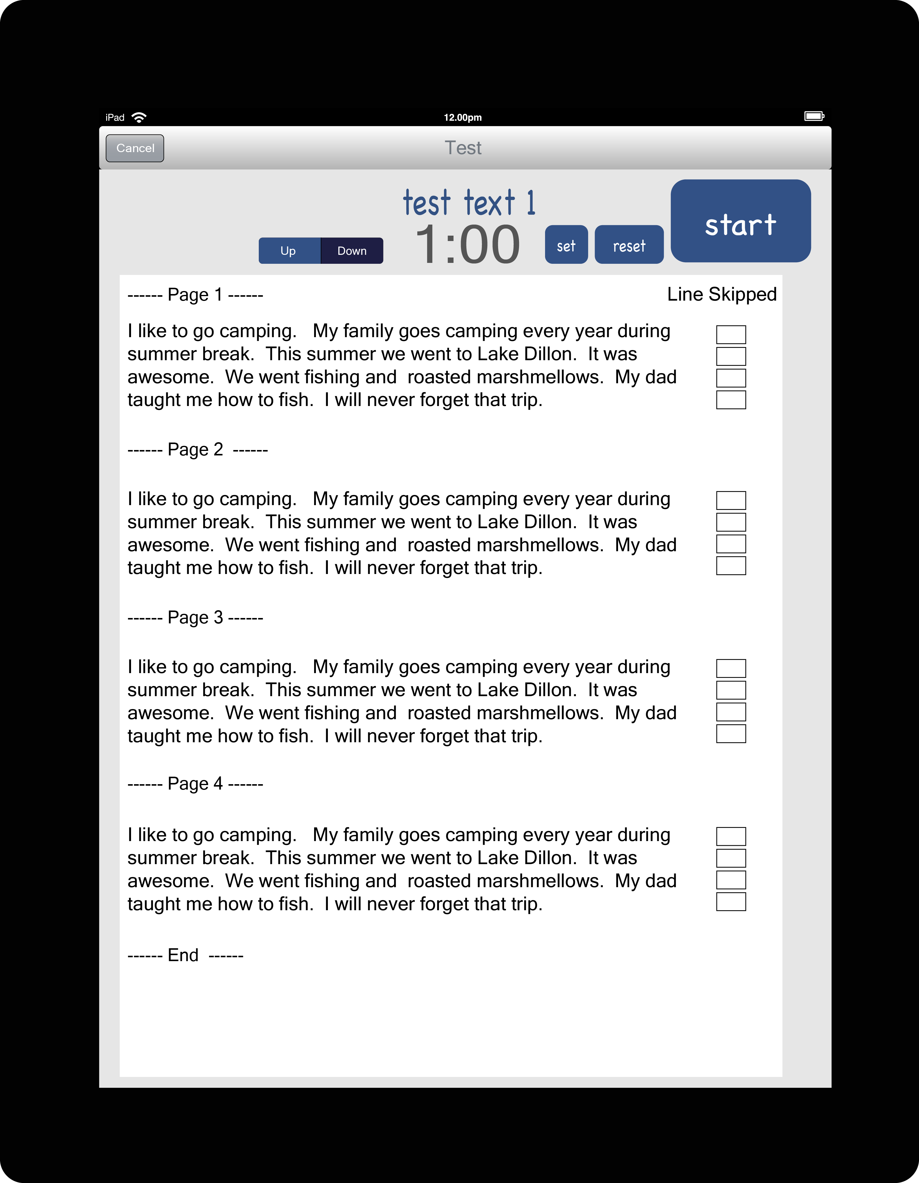
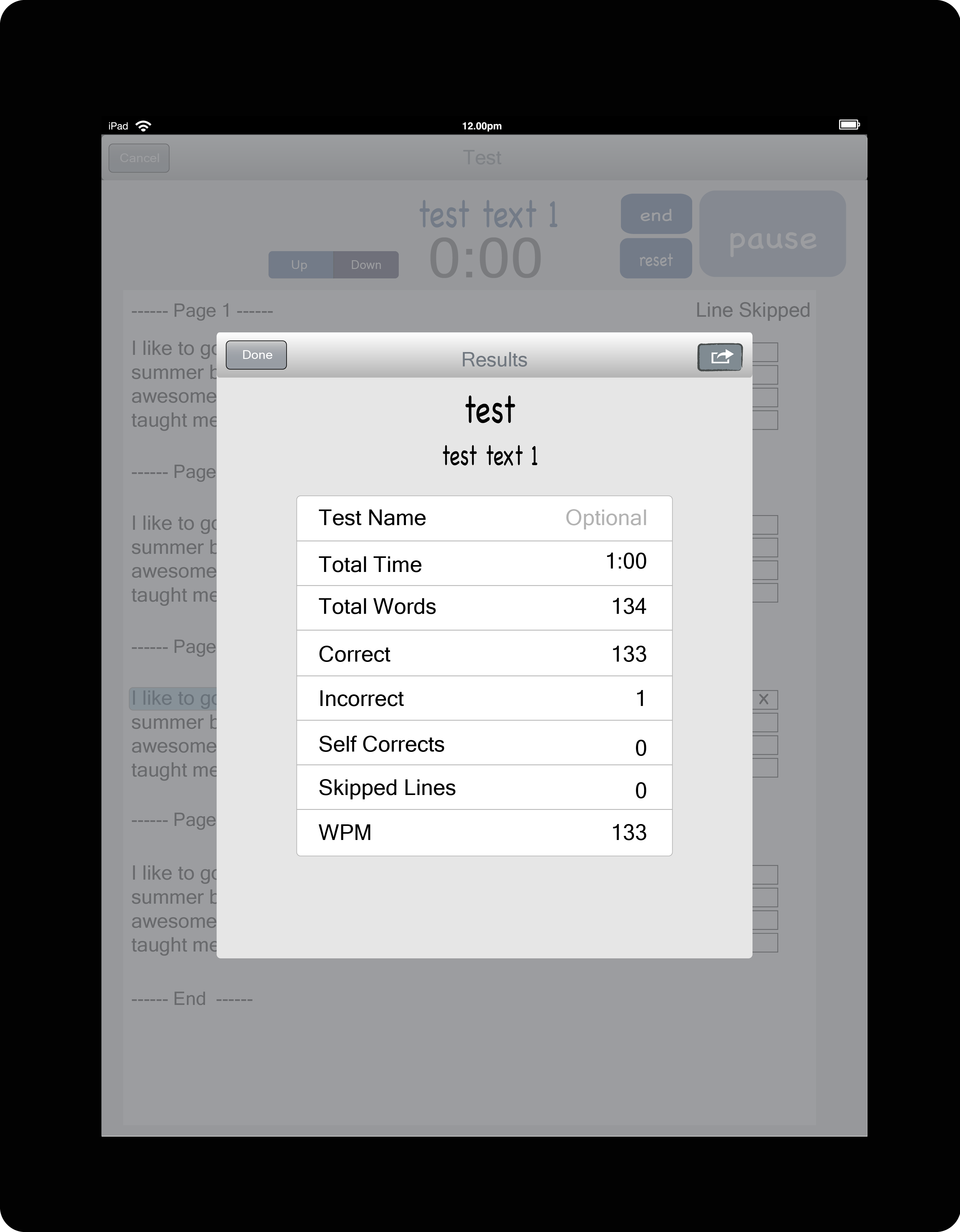
Teachers can keep track of reading accuracy, as well as, see results from the test after each session. The start/stop feature allows for some flexibility for those moments you did not plan for.
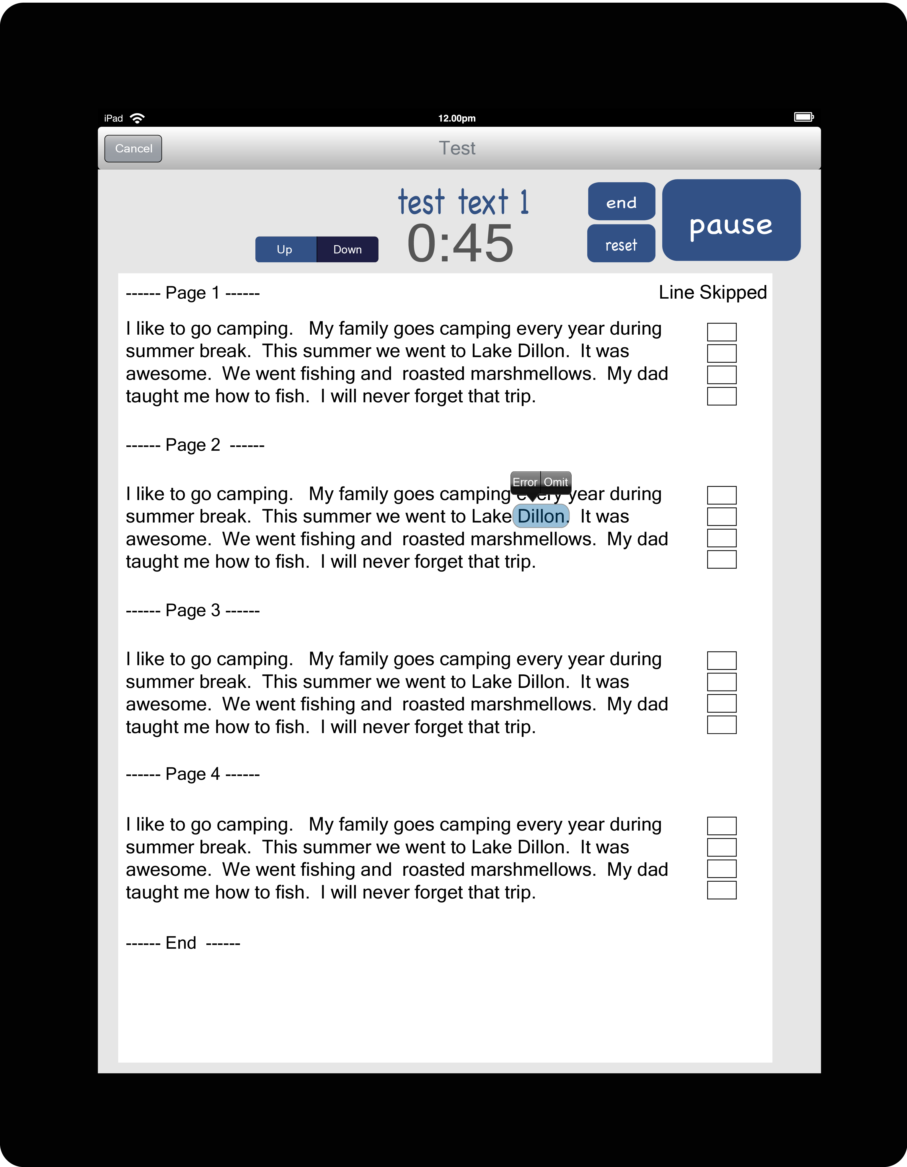
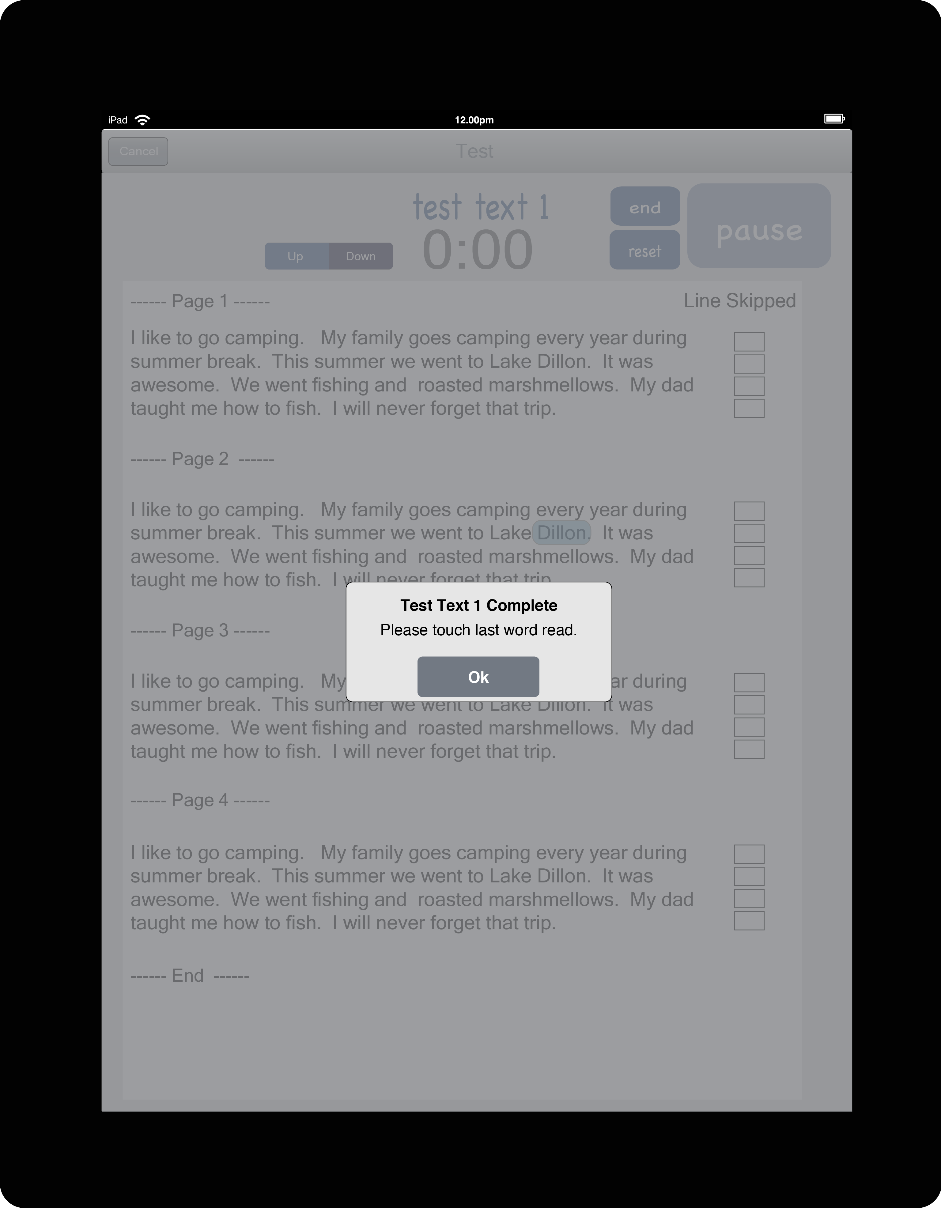
Once started, the 1 minute timer will count down automatically removing the need for a stopwatch. The teacher taps on the words missed by the student. After 1 minute is up, the teacher taps on the last word read and a score is automatically generated for that student. Previous scores are all kept for each student for future reference.




ACHIEVED METRICS
- Teachers were saving roughly an hour of class time by not having to get a new testing sheet for every student and 3 hours out of class by not having to keep track of all paper tests and record keeping.
- Teachers were able to test more students per day by having all students, texts, and records available in one app saving another hour of instructional time per week.
SELECTED WORKS
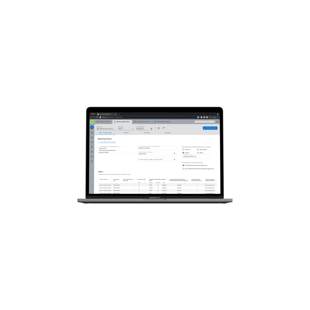
Section 16 ReportingApplication Design
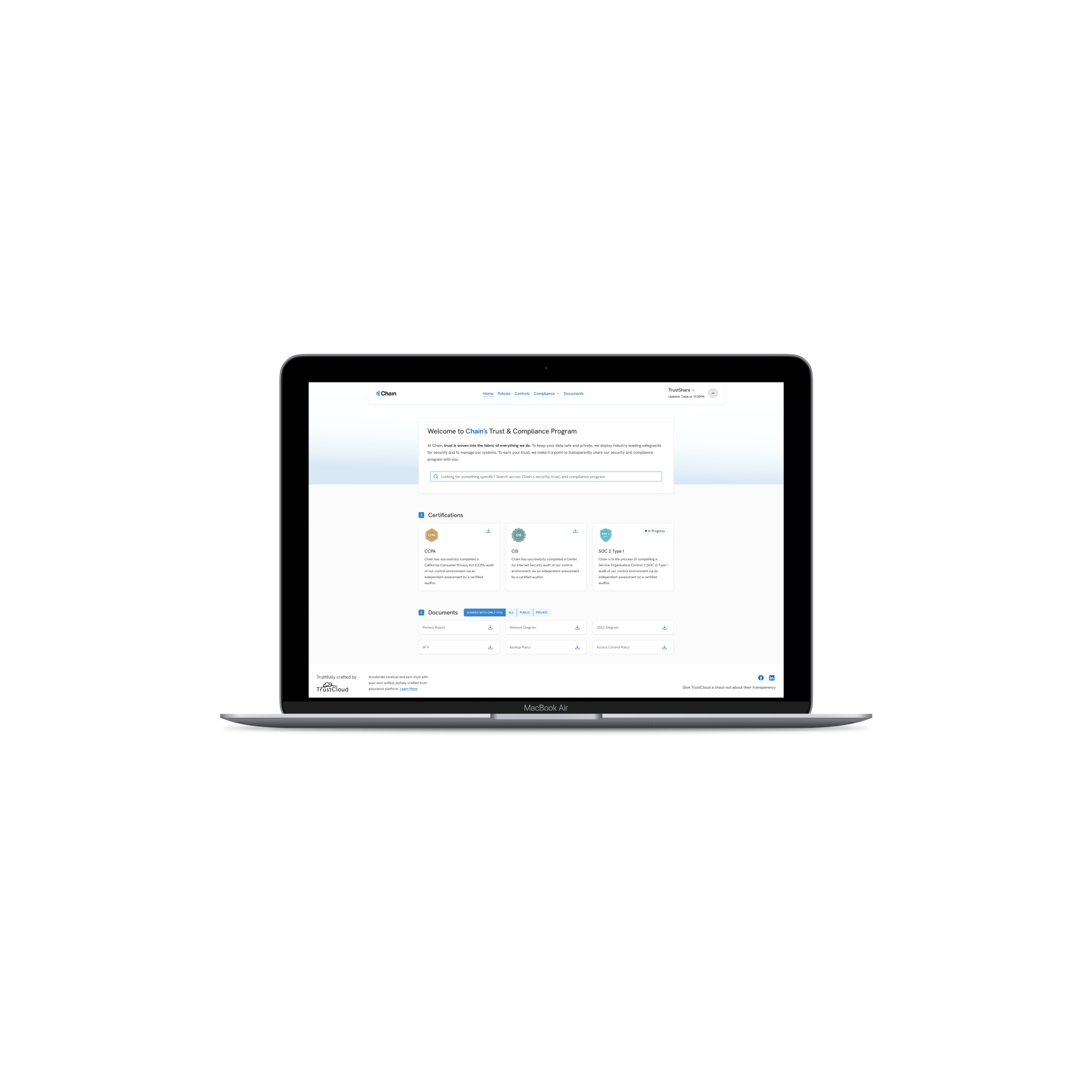
TrustShare Portal and Deal TrackerApplication Design
API Integration ApplicationEnterprise App Design
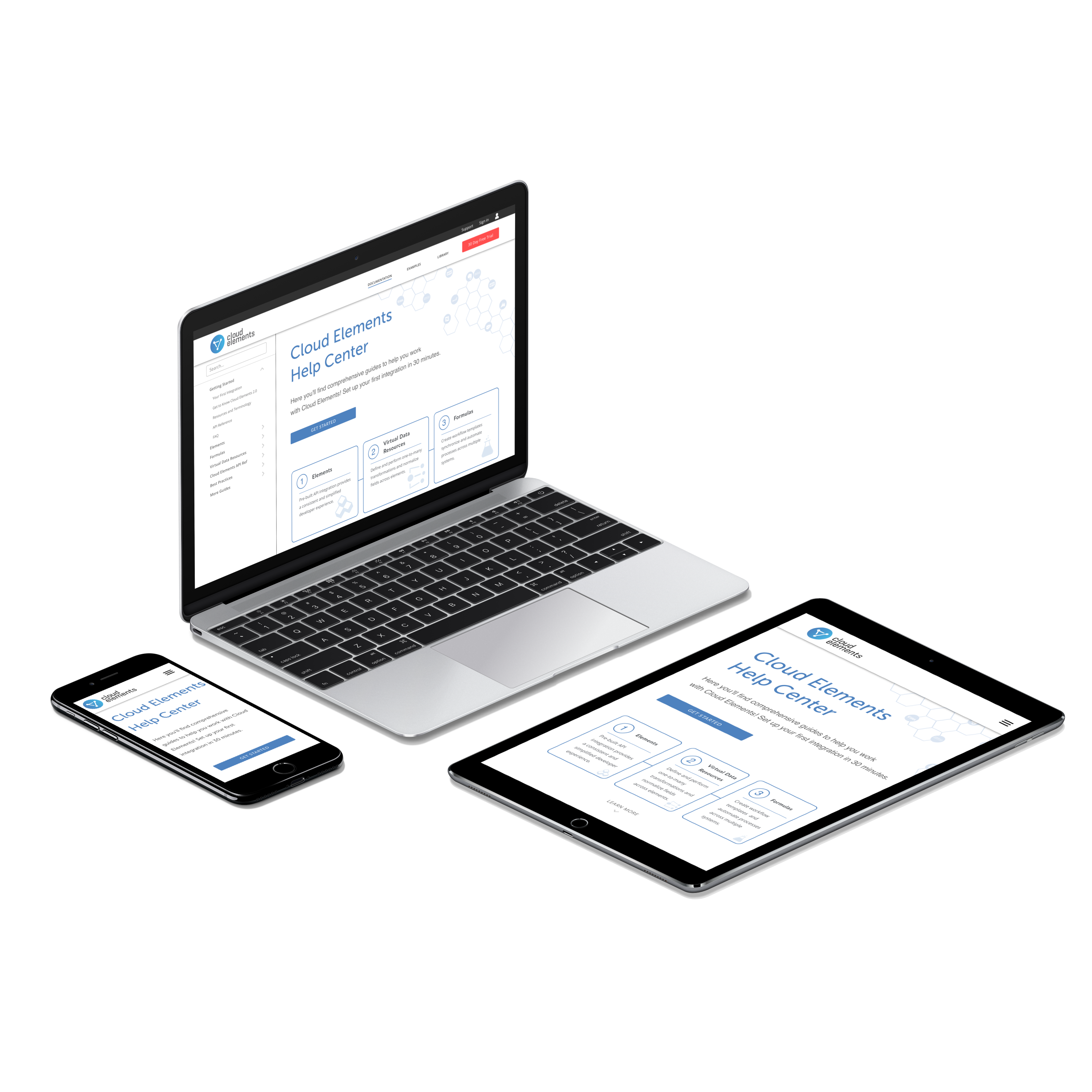
Cloud Elements Help CenterWebsite Design
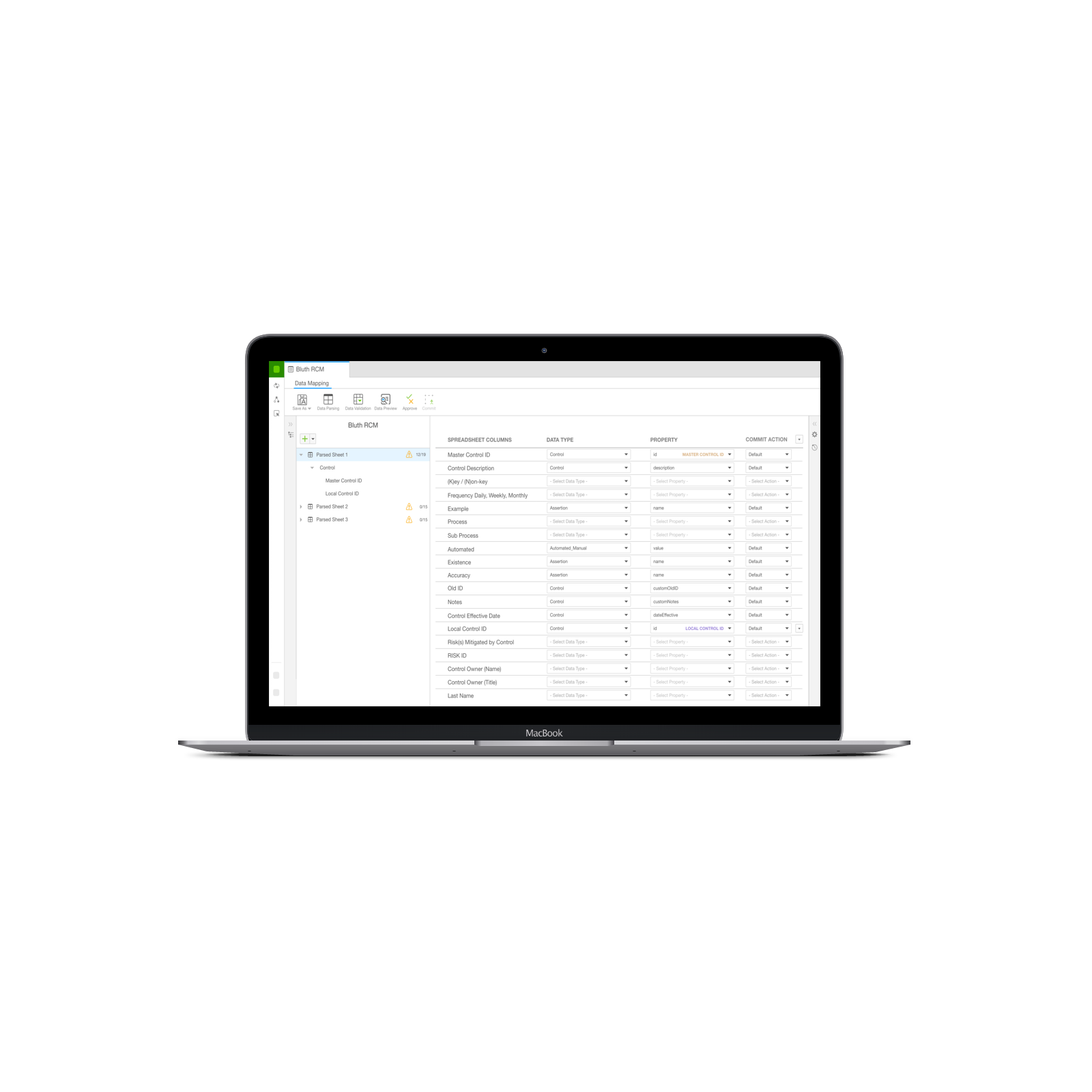
Data ModelerApp Design
Get in Touch